The Blogger platform offers you different mobile templates for your site. You can choose between built-in templates (Simple, Picture Windows,…) or you can select a Custom mobile template, which will adapt your main template to the mobile version. This enables you to have a site with a consistent theme on both desktop and mobile devices. One part that might not be consistent though is with a header image. Depending on the options selected in the Layout section, the mobile template (either custom or built-in) might not show a header image. In this post, we will examine two ways to solve this problem.
 |
 |
The problem of the mobile template not showing a header image will only happen when you have a specific option selected in the "Configure Header" window in Layout section. One solution is to change to another option, the other solution (this only applies when using a custom mobile template) is to modify the template code. First, let's try to solve the problem by changing the option in the Layout section.
?m=1 at the end of your URL.Solution 1 – Remove description of the header in Layout Section
Go to Layout section. Under NavBar gadget, there should be Header gadget. For that gadget, click on Edit link.
A new window with the name “Configure Header” will open. This is where you set up your image header. At the bottom of the window you should have 3 options under Placement option:
- Behind title and description
- Instead of title and description
- Have a description placed after the image

But what if you still want to keep option 1 or you want to use a different image for a mobile version? In this case, the modification of a template code is necessary and this is discussed next.
Solution 2 – Modify Blogger Template Code
To keep an option 1 “Behind title and description” and still have a header image in mobile version, we need to modify the template code. This solution only applies to custom mobile template!!!!
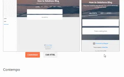
- In Dashboard, choose Template section and then click on "Edit HTML" button.

- Under “Jump to widget" dropdown menu, select Header1.

- The first line should start with a
<b:widget>tag ofid="Header1", something like this:
<b:widget id='Header1' locked='true'. Expand it by clicking on the arrow located right of the line number as shown below:

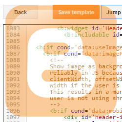
- Line
<b:includable id='main'>should show up. Expand it the same way by clicking on the arrow besides the line number.

- After expanding, a lot of template code inside it will get revealed (more than 50 lines). In the code that just expanded, find the first
<b:else/>line. Below it, you should find the code same or similar to the one below. This code shows your image, title and description for a desktop version. We need to copy that and put it inside the mobile part of the code. Select and copy those lines from your template. - Now move few lines up in the template until you find this line:
<b:if cond='data:mobile'>and below it, there should be<div id='header-inner'>. Leave that line but remove everything inside it as marked below by yellow highlighted lines:Inside now empty
<div id='header-inner'>paste the lines you copied from step 5. This will cause the header image, title and description to show in mobile version same way it does with desktop version. - Click on “Save Template” button.
Using another image for mobile version of your template
Sometimes the header image for the desktop is not appropriate for mobile version of your site. In this case we can use the alternative image by referring to its custom URL. We do this by replacing first line in code from step 5 to be something like this:
Just replace the following placeholders in the above code:
- YOUR_URL to the URL of your image.
- IMAGE_ HEIGHT to the height of your image.
For example, if height is 400px, then the code would be:
min-height:400px;_height:400px;
If the image is not shown properly, modify the CSS background properties to fix them. If you are not familiar with them, check this article for more comprehensive tutorial.
Summary
If you want to keep the consistency of your website between desktop and mobile versions in Blogger, you need to use a Custom mobile template. If the header is configured, so that the image is shown behind the title and description, the image will not be shown in the mobile version. This can be solved in two ways. Change the way the image is shown regarding title/description or by customizing your blogger template.
I hope you found this article helpful. If so, consider dropping a comment or sharing it on social networks.


Borei Design
August 20, 2016I found all the code you are referencing in solution 2 but I still cannot get my header imagine to show on my mobile site. Could you please help?
admin
August 21, 2016Your
<div class='header section' id='header' name='Header'>seems to be empty. I'm guessing you are missing the code in the template after<b:if cond='data:mobile'>. Inside it, create<div id='header-inner'></div>and inside that, copy the lines from step 6. This should solve the problem.Kenneth
August 30, 2017can't make "Using another image for mobile version of your template" work following your instructions.
sachin khandare
January 24, 2018Great! Thanks! it worked!
Mark
December 31, 2018Thanks for this information really appreciate it.
Andree
August 20, 2022I think I followed directions perfectly but it doesn't seem to be working.
🙁
admin
August 20, 2022Hi,
Which solution did you try? The first or second one?