Modifying a template in Blogger is a very powerful feature. It allows you to make significant modifications to your blog which helps your blog to distinguish itself from millions of other blogs. It also gives you the ability to add interactivity to your blog. This article will show how to achieve that for both Desktop and Mobile Template.
Some cases which require modifications of the template:
-
Changing the Theme of your blog
You change a theme by modifying the CSS code in the template. If you are familiar with CSS and HTML, then modification of template code is best suited for you. Otherwise, use Blogger Template Designer as it gives you the ability to modify the theme without the need to deal with CSS and template code.
It is located at Dashboard > Template. Once there, click on Customise button. -
Changing the Layout of your blog
Maybe you are not satisfied with the default layout and want to change it. For example, by default, you can not add any gadget in the header part of the layout as there are no Add a Gadget links located there. Modifying template code solves that problem.
Click image to enlarge
-
Changing the code of the Widget Templates
If you want to change the HTML output that the template generates, then you need modify widget code in the template. One reason for that would be to improve Search Engine Optimization.
-
Adding Interactivity to your blog
If you would like to spice up your blog, then adding various jQuery plugins will achieve that by adding their code into the blogger template. In most cases, you should add the jQuery code at the end of the template before
</body>tag.

Modifying a Template
To modify a template either for desktop or mobile devices, you have to do the following:
- Important! Backup your template. Before doing any modifications, you should always backup your template on your computer first just to be on the safe side. Go to Dashboard > Template and click on Backup / Restore button located on the top right corner and click on Download full template.
Note:If you are interested in backing up whole site, not just a template, check my other article: How to make a complete backup of your blog.
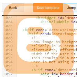
- After you made a backup, you are now ready to start with modifications. Go to Dashboard > Template tab and click on Edit HTML button.
- You get an edit window containing template code where you can do all the necessary modifications. If you want to edit widget code, you can use Jump to widget drop-down menu to quickly locate the widget.
- Some modifications require you to find particular code in the template and since the template contains lots of code, you might find it difficult to locate that code. To help you with that, use some sort of text editor by copying whole template there and then use Find command.
Note: I am personally using Notepad++, a free Code Editor that supports several programming languages including XML for our templates.
- Use Preview button to check the result of modifications. After you are satisfied with the result, click Save Template button.
Modifying template for mobile devices
When you are optimizing your blog by directly modifying the template, you should also take into consideration the visitors that use mobile devices to visit your site. Modifying Blogger's template for mobile devices is the same as modifying a normal template (steps 1-5 above), except that you need to do one additional step. You need to set the mobile template to Custom, otherwise you will not be able to see any changes you make in the mobile parts of the template.
By default, the mobile template is set to default template. To set it to Custom, do the following:
-
Click on Settings button which is located below Mobile.

-
This will open new window and once there, choose Custom mobile template under Choose mobile template.

-
Click Save and now your mobile part of the template is ready to accept any changes and additions that you make.

?m=1 at the end of the URL and the browser will display mobile version of your site.When Settings button for Mobile is missing
We can choose many different Blogger themes under Theme section that are grouped in categories with such names as Contempo, Soho, Emporio, Simple and so on. For some of them, the setting button under Mobile will be missing as shown below:

These themes don't have a different section for Mobile, instead, they use responsive design, in which the websites behavior for smaller screens are determined by CSS inside the theme. If you check the theme code by clicking on Edit HTML, you should see a lot of CSS code and you will notice the use of media queries. To learn more about responsive design and about CSS media queries, check this article.
Useful Resources
If you want to learn more about the technologies mentioned above, check the links below:
-
HTML and CSS
-
Blogger Template Code
Page Elements Tags for Layouts (from Google)
7 Blogger Page Types -
jQuery
JSFiddle (experiment with javascript / jquery code in interactive window)
Conclusion
In this article, we examined why and how to modify blogger templates. This is a big topic, so the article also listed a few links to resources you might find useful when modifying your template. If you think of any other resource that would be useful for blogger template modifications, feel free to suggest them and I might add them to the list.
I hope you have found this post useful. Feel free to comment or share it on your social networks.

EboolinkBD
July 17, 2013Thank You for your info but i have tried and failed. please help me.
admin
July 18, 2013I have noticed that you were looking for mobile template modifications. If you just want to fix style like colors or font size, then first find in the template CSS part that is located inside
<b:skin>tags in the beginning of the template. Class selectors that start with.mobileare the one for mobile.Watesh
October 27, 2013Is there a way to move the adsense to be just after the blog post instead of having the share buttons in between?
bee
June 2, 2015hi, all the colors in my website went crazy after some template changes I made. So it was a relieve that I found your post and who would have guessed it was just so simple. But I have a problem now....the header is not showing in mobile. Any suggestions? Thanks.
admin
June 20, 2015Hi,
Depending on the layout option, your header might not show up in mobile version. I have just made a post regarding this same issue Here. I hope you find it useful.
yinyin
June 29, 2015Hi does anyone know how to enlarge and center the thumbnail pic on mobile template? And then the post snippet to follow below it.
Thanks in advance
Frog
June 7, 2016Hello, that is amazing tutorial. Thank you. But can you help me please?
I have a custom template of desktop version and for mobile it was similar (color, background...) Suddenly something happened, and mobile version is now different.
Background is white, texts dark.. I tried to restore it by changing templates, but nothing helped. Is there some way, to use main template and apply to mobile version?
I tried to set background by tags in main template to CSS of mobile classes, but that didn't help.
And one more question. Is there way, to put in mobile version some menu? Its very hard to find some post in history, if I dont't use archive or categories. Thank you very much and nice day.
admin
June 9, 2016Hi,
Are you sure, you have "Custom" mobile template in the settings as shown on this article? I checked your site and noticed, that your body tag has the following:
<body class=" mobile variant-simplysimple">.This looks as your site is using one of those predefined mobile templates and not a custom one.
Maninder Singh
November 7, 2020Pls help as I want to show my website as desktop view in desktop not mobile view in desktop .
I'm using contempo theme
Pls check my website in both view
admin
November 7, 2020Hi,
I have checked your website to see why your website is showing as mobile mode even on desktop. I looked into the HTML generated source code of the website and it seems the theme is calculating that your desktop mode starts at 2720px of display width. The reason for this is probably the large width of your background picture (2560px). For example, the default Contempo theme has a background picture with a width of only 1600px.
So try reducing the width of your background picture. I hope this will solve your problem.
Frog
June 10, 2016You are welcome:) Previously I wrote to you this:
Yeah, it was very helpful. Thank you:) If I dont bother you yet, I have two little problems yet. If you want to help me again. In desktop main template, when I chose some label (tab) and go to these type of posts, label name in menu jumps up, right blue border is lost and font is smaller and maybe different. This was default in original template. I tried to find css, but without success. There are many "tabs" code, but didnt find this one.
And second problem, or maybe just improvement. Is there a way to set selected link in my mobile menu to different color, so user would see, where he is in categories? I tried to set pseudoclasses like hover, visited, focus and so on, but it wasnt ok, perhaps because thats everytime new site, not the one with clicked link. I dont know how to do that somehow easily. But it is too difficult, let it go.
If you have some others users for solving their problems, its ok. I thank you very much for previously help and your time and I try to figure out on my own. You helped me enough yet:) Martin
Gabby
August 28, 2016How can I center my post title in mobile view? It shifts towards the left side instead of being at the center.
Please need help on how to correct this.
admin
August 28, 2016Hi,
In your blogger template check for
.mobile-index-titleclass selector and removewidthproperty. If this class selector is not there, then add it and set width to auto like this:.mobile-index-title{
Width:auto;
}
This should solve your problem.
Gabby
August 29, 2016Thanks for your reply.
Unfortunately, there is no ".mobile-index-title" in my template.
I want to add it as you advised but don't really know the particular place to add it.
admin
August 29, 2016In Dashboard go to Template and click on Edit HTML button.
Your template code will show up. Find
.mobile-index-titleand if you don't find it, locate<style>tag and inside it put that code from my previous reply.If you are not familiar with modifying template, I suggest you do a backup first. if you are not sure how to do that, check my other article about creating a backup on Blogger. You don't need to do a complete backup, just template backup should be enough.
Gabby
August 29, 2016It works!!!
Don't really know how to start thanking you. My God will reward you abundantly.
Kasia
September 29, 2016Hello, I have a side bar with page widgets on my blog. The web version works perfectly displaying page title and the link to the page directly underneath, e.g.
- My Facebook Page
- Facebook (link)
When I go onto the mobile version, however, all i can see is the word "Home" instead of either the Page name or the link name. Only after clicking on one of the "home" buttons I have a choice to click on either another "home" or "facebook". Links work all fine but it is rather ugly to see "home" 4 times at the top of the mobile page.
I am a little surprised by this as I specifically unticked showing "home" in the gadget dialogue box.
Any solutions? Thank you!
admin
September 29, 2016Hi,
I wrote an article about your issue. You will find there step by step instructions on how to fix this.
I hope you find it useful.
vijaya
March 4, 2017Hi admin
Great assistance above.
My query is - In mobile version, currently the tabs of the blog are coming in drop down list. i would like all tabs visible all time very unlike drop down, how may i do it?
thanks in advance
admin
March 4, 2017Hi,
Check my other article about Modifying Blogger Pages Widget on how to do that.
Techie Pen
May 16, 2017Great Article.
M.S
August 22, 2017Hi,
Quick question, I hope you can help. I have chosen to have the custom mobile theme as a background. But when I view my blog on my phone, the background theme/picture only covers half the screen unlike the web version. As you scroll down on your phone the theme doesn't follow all the way through. Do you know how I can fix this? when I preview the mobile version on the laptop it seems to be fine.
admin
August 22, 2017Hi,
Can you provide the URL?
yael
September 14, 2017I got a weird problem on mobile. I have a page that I wrote as html and its rather long. when loaded on mobile all I see is a blank page until I start scrolling down and only then I can see my page. Any ideas?
url: http://socialgreenmov.blogspot.co.il/p/blog-page_5.html
Thanks
admin
September 15, 2017Hi,
Yes, your blogger site really is acting a little strange. The problem seems to be that when appending
?m=1to the end of the URL, the mobile version is not shown.Here is some random page from another blogger website and if you do the same there, it loads as you would expect. After appending
?m=1, mobile version of the site is loaded.Only thing I can think of is maybe under "Theme > Choose mobile theme" you have "No. Show desktop theme on mobile devices." option selected.
yael
September 16, 2017I dont see that option at all.
Any ideas what to do?
admin
September 16, 2017After some digging it seems newer blogger themes do not have part of template for desktop and part for mobile, but use responsive layout instead. So missing button for mobile customization is not the problem.
I did check the CSS on your website and I suggest to remove the following CSS code:
/* Hide table headers (but not display: none;, for accessibility) */thead tr {
position: absolute;
top: -9999px;
left: -9999px;
}
yael
September 17, 2017Thanks! That solved it.
That's what happens when you copy&paste....
admin
September 17, 2017So you don't have this when you click on "Theme" option in the Dashboard? Can you provide me with the screenshot of what you have?
yael
September 17, 2017no. how do i send you a pic ?
admin
September 17, 2017On the Contact page, you can find my email. Send it there.
yael
September 17, 2017sent
Sophie
October 2, 2017Hello !
I've got a big problem :
http://sophierstr.blogspot.fr/?m=1
As you can see, i've got two navbar and the first burger isn't working and my main menu's appareance looks like the two navbar.
I've download this theme (named Rosemary) and i don't know how to fix it.
Can you help me ?
Thank you !
admin
October 3, 2017That second centered navigation bar seems to be a linked list. You can remove it with the following steps:
Joe
December 9, 2017Thank you so much.
Your guide really really helped me in making my blogger mobile template to reflect the changes I made in my blogger desktop template.
Once again, thank you so much.
Frks
January 21, 2018no gear icon under mobile what to do?
rvwv
January 31, 2018any solution for mobile?
Sandra L.
February 3, 2018Need help. Well actually trying to help a online friend with her blog. I haven't used my blog for years so am a tad rusty. lol.
I never had my blogs set to mobile. I don't have a mobile phone and forgot about the people that only access using their phone, but back in 2009 when I used my blogs that wasn't such a 24 hour a day thing...now it is.
She would like her blog to be accessed by both computer and mobile but I am clueless as to how to help her do that.
Any help would be greatly appreciated.
Thank you
admin
February 3, 2018Hi,
What platform does her blog use? Is it on a Blogger platform or is something else like WordPress?
Sandra L.
February 4, 2018Thanks for the quick reply.
She is using the Blogger platform. Sorry I should have stated that in my original posting.
admin
February 4, 2018Try this. On the Dashboard, click on "Theme" and under "Mobile" click on "Gear" icon (check step 1 in "Modifying template for mobile devices" on this article). There you should be given the following option:
On mobile devices, show a mobile version of your current theme.
Select "Yes" and click "Save". To test the website under mobile, just append /?m=1 at the end of the URL.
Sandra L.
February 4, 2018Worked perfectly.
I have been using my old blog as a test for the things she wants changed or added and I can't thank you
enough. Going back and forth with her is hard, as she is pretty much clueless about blogger other than how to make
a post. Would be easier if she would let me log into her blog and just do it all at once. But then again, a
learning lesson for her and honing up on my forgotten skills at the time time. Now my 13 grandson wants me to
show him how to build one.
Thanks for much for all you do for all of us that get stumped. Greatly appreciated.
Arpan
May 18, 2018as i have to change the header styling for the mobile ,and i have go to the theme and the mobile setting option but it is not showing the setting option in the page only customize and edit html is showing for the desktop version how i can get the setting option if it is not showing in it..... can u help me in this as i have to change the header format in the mobile browser ... it is showing me default one only
plusnet
April 26, 2019Awesome! Thanks you!
Bhawesh
January 31, 2020That settings under mobile in blogger blog theme is hidden. How do i get that ?
admin
January 31, 2020Hi,
Not all blogger themes have "Settings" button, as they are already made to be mobile responsive. I have now updated the article.
Tommas
November 28, 2020How can I force the mobile version on desktop?
admin
November 30, 2020Hi,
Check the HTML source code of your theme. It might have CSS rules at what width it switches to mobile. You can then just increase this width a lot, that way, it would always be mobile even on desktop.
The HTML source code might have something like this:
<Group description="Widths">

  <Variable name="sidebar.width" description="Sidebar width" type="length"

            min="100px" max="1000px" default="284px"  value="284px"/>

  <Variable name="content.width" description="Content width" type="length"

            min="600px" max="2400px" default="922px"  value="922px"/>

  <Variable name="content.margin" description="Content margin" type="length"

            min="0px" max="1000px" default="117px"  value="117px"/>

</Group>
Or you can try modify the @media properties:
@media screen and (max-width:800px){
Pavan Teja
July 11, 2021Hi Admin, Can You Please Help me with this problem. Actually, When my blog is seen from a Desktop it is perfectly well. Despite Using a Responsive template still, there is a white space all the way around the sides when the blog is viewed from a Mobile Phone. I Hope you got the Issue. Please Help Me with this.
Thanks in Advance.
admin
July 11, 2021Hi,
I checked your website and it seems the problem is caused by padding inside the following rule for mobile sizes:
@media screen and (max-width: 1100px) {...
#content-wrapper {
...
padding: 0 20px;
...
}
...
}
Setting that padding to 0 should remove the white space on the left/right side of your website.