When we create a new app project, we are given a simple counting app by default. That is all well and good, but what if we want to see examples of other various widgets in action? This is where the --sample argument for the flutter create command-line comes into play. the --sample argument requires a valid id value and in this article, we will learn what those valid id values are and how to choose them in this article.
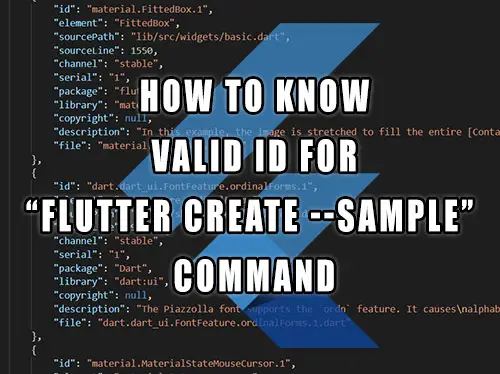
When using the flutter create --sample=<id> command, we need to give it an id value. Here is an example on how to create a Scaffold sample project by using the id of value material.Scaffold.1:
There are a few ways to determine what valid values can be used for id and what value for any particular widget to use when we use the --sample argument.
Using the Flutter official widgets page
The simplest way is to visit the official Flutter docs website, which contains a dedicated widgets page organized by category. We can also browse all of the available widgets on the widgets index page.
Most of the widgets should have a working example and some will also display the required id to use for the --sample argument inside the flutter create command as shown below:

You can use the Flutter samples table at the end of this article to find the id that interests you and then copy the widget name part into the "search API docs" field.

In the above example, given a sample id of material.Scaffold.1, the widget name is "Scaffold", the "material" is a library name, while the "1" is a sample number, so we entered Scaffold into a search field.
Browsing the GitHub api/lib folder
Another approach is to simply not use the --sample argument and make the default counter app with the flutter create <output directory> command and then we replace the generated content of the main.dart file with the content of the widget source code located in the official Flutter GitHub page.
The examples of widgets are located at flutter/examples/api/lib folder of the Flutter GitHub repository.
Table of all samples from --list-samples argument
The flutter create command also has the --list-samples command-line argument available that outputs the information about all the samples into a JSON file.
A table of all the samples generated by that JSON file is available below. When you find the sample you are interested in, use the id value for the --sample argument:
The table contains 543 entries. To narrow your search for a specific widget sample, use the search field below.
| id | description |
|---|---|
| material.Focus.2 | This example shows how to wrap another widget in a [Focus] widget to make it focusable. It wraps a [Container], and changes the container's color when it is set as the [FocusManager.primaryFocus]. If you also want to handle mouse hover and/or keyboard actions on a widget, consider using a [FocusableActionDetector], which combines several different widgets to provide those capabilities. |
| material.AnimatedAlign.1 | The following code implements the [AnimatedAlign] widget, using a [curve] of [Curves.fastOutSlowIn]. |
| widgets.FocusNode.unfocus.1 | This example shows the difference between the different [UnfocusDisposition] values for [unfocus]. Try setting focus on the four text fields by selecting them, and then select "UNFOCUS" to see what happens when the current [FocusManager.primaryFocus] is unfocused. Try pressing the TAB key after unfocusing to see what the next widget chosen is. |
| widgets.LinearGradient.1 | This sample draws a picture with a gradient sweeping through different colors, by having a [Container] display a [BoxDecoration] with a [LinearGradient]. |
| cupertino.RawAutocomplete.3 | This example shows the use of RawAutocomplete in a form. |
| material.Navigator.1 | The following example demonstrates how a nested [Navigator] can be used to present a standalone user registration journey. Even though this example uses two [Navigator]s to demonstrate nested [Navigator]s, a similar result is possible using only a single [Navigator]. Run this example with `flutter run --route=/signup` to start it with the signup flow instead of on the home page. |
| widgets.AlignTransition.1 | The following code implements the [AlignTransition] as seen in the video above: |
| material.AnimatedContainer.1 | The following example (depicted above) transitions an AnimatedContainer between two states. It adjusts the `height`, `width`, `color`, and [alignment] properties when tapped. |
| material.AutofillGroup.1 | An example form with autofillable fields grouped into different `AutofillGroup`s. |
| material.showDatePicker.1 | This sample demonstrates how to create a restorable Material date picker. This is accomplished by enabling state restoration by specifying [MaterialApp.restorationScopeId] and using [Navigator.restorablePush] to push [DatePickerDialog] when the button is tapped. |
| cupertino.RawAutocomplete.2 | This example is similar to the previous example, but it uses a custom T data type instead of directly using String. |
| widgets.SliverFillRemaining.1 | In this sample the [SliverFillRemaining] sizes its [child] to fill the remaining extent of the viewport in both axes. The icon is centered in the sliver, and would be in any computed extent for the sliver. |
| cupertino.LogicalKeySet.1 | In the following example, the counter is increased when the following key sequences are pressed: * Control left, then C. * Control right, then C. * C, then Control left. But not when: * Control left, then A, then C. |
| material.VerticalDivider.1 | This sample shows how to display a [VerticalDivider] between a purple and orange box inside a [Row]. The [VerticalDivider] is 20 logical pixels in width and contains a horizontally centered black line that is 1 logical pixels thick. The grey line is indented by 20 logical pixels. |
| cupertino.CupertinoContextMenu.1 | This sample shows a very simple CupertinoContextMenu for an empty red 100x100 Container. Simply long press on it to open. |
| material.SwitchListTile.1 | 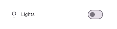 This widget shows a switch that, when toggled, changes the state of a [bool] member field called `_lights`. |
| material.Stepper.controlsBuilder.1 | Creates a stepper control with custom buttons. |
| material.InputDecoration.label.1 | This example shows a `TextField` with a [Text.rich] widget as the [label]. The widget contains multiple [Text] widgets with different [TextStyle]'s. |
| widgets.NestedScrollView.3 | This simple example shows a [NestedScrollView] whose header contains a snapping, floating [SliverAppBar]. _Without_ setting any additional flags, e.g [NestedScrollView.floatHeaderSlivers], the [SliverAppBar] will animate in and out without floating. The [SliverOverlapAbsorber] and [SliverOverlapInjector] maintain the proper alignment between the two separate scroll views. |
| widgets.MouseRegion.onExit.1 | The following example shows a blue rectangular that turns yellow when hovered. Since the hover state is completely contained within a widget that unconditionally creates the `MouseRegion`, you can ignore the aforementioned restriction. |
| dart.dart_ui.FontFeature.proportionalFigures.1 | The Kufam font supports the `pnum` feature. It causes the digits to become proportionally-sized, rather than all being the same width. In this font this is especially noticeable with the digit "1": normally, the 1 has very noticeable serifs in this sans-serif font, but with the proportionally figures enabled, the digit becomes much narrower. 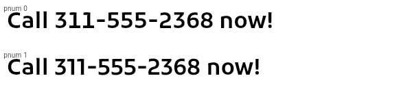 |
| cupertino.ListView.7 | This example shows a custom implementation of [ListTile] selection in a [ListView] or [GridView]. Long press any ListTile to enable selection mode. |
| material.RangeSlider.1 | 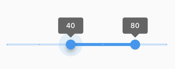 This range values are in intervals of 20 because the Range Slider has 5 divisions, from 0 to 100. This means are values are split between 0, 20, 40, 60, 80, and 100. The range values are initialized with 40 and 80 in this demo. |
| cupertino.NestedScrollView.1 | This example shows a [NestedScrollView] whose header is the combination of a [TabBar] in a [SliverAppBar] and whose body is a [TabBarView]. It uses a [SliverOverlapAbsorber]/[SliverOverlapInjector] pair to make the inner lists align correctly, and it uses [SafeArea] to avoid any horizontal disturbances (e.g. the "notch" on iOS when the phone is horizontal). In addition, [PageStorageKey]s are used to remember the scroll position of each tab's list. |
| cupertino.Draggable.1 | The following example has a [Draggable] widget along with a [DragTarget] in a row demonstrating an incremented `acceptedData` integer value when you drag the element to the target. |
| widgets.AspectRatio.1 | This examples shows how AspectRatio sets width when its parent's width constraint is infinite. Since its parent's allowed height is a fixed value, the actual width is determined via the given AspectRatio. Since the height is fixed at 100.0 in this example and the aspect ratio is set to 16 / 9, the width should then be 100.0 / 9 * 16. |
| material.IconButton.2 | In this sample the icon button's background color is defined with an [Ink] widget whose child is an [IconButton]. The icon button's filled background is a light shade of blue, it's a filled circle, and it's as big as the button is.  |
| widgets.EditableText.onChanged.1 | This example shows how onChanged could be used to check the TextField's current value each time the user inserts or deletes a character. |
| material.AnimatedWidget.1 | This code defines a widget called `Spinner` that spins a green square continually. It is built with an [AnimatedWidget]. |
| material.GlowingOverscrollIndicator.2 | This example demonstrates how to use a [NestedScrollView] to manipulate the placement of a [GlowingOverscrollIndicator] when building a [CustomScrollView]. Drag the scrollable to see the bounds of the overscroll indicator. |
| cupertino.CupertinoSliverRefreshControl.1 | When the user scrolls past [refreshTriggerPullDistance], this sample shows the default iOS pull to refresh indicator for 1 second and adds a new item to the top of the list view. |
| widgets.SharedAppData.2 | The following sample demonstrates how a single lazily computed value could be shared within an app. A Flutter package that provided custom widgets might use this approach to share a (possibly private) value with instances of those widgets. |
| cupertino.AnimatedPositioned.1 | The following example transitions an AnimatedPositioned between two states. It adjusts the `height`, `width`, and [Positioned] properties when tapped. |
| cupertino.RawScrollbar.1 | This sample shows an app with two scrollables in the same route. Since by default, there is one [PrimaryScrollController] per route, and they both have a scroll direction of [Axis.vertical], they would both try to attach to that controller. The [Scrollbar] cannot support multiple positions attached to the same controller, so one [ListView], and its [Scrollbar] have been provided a unique [ScrollController]. Alternatively, a new PrimaryScrollController could be created above one of the [ListView]s. |
| material.Hero.1 | This sample shows a [Hero] used within a [ListTile]. Tapping on the Hero-wrapped rectangle triggers a hero animation as a new [MaterialPageRoute] is pushed. Both the size and location of the rectangle animates. Both widgets use the same [Hero.tag]. The Hero widget uses the matching tags to identify and execute this animation. |
| widgets.MouseCursor.1 | This sample creates a rectangular region that is wrapped by a [MouseRegion] with a system mouse cursor. The mouse pointer becomes an I-beam when hovering over the region. |
| material.IconButton.1 | This sample shows an `IconButton` that uses the Material icon "volume_up" to increase the volume. 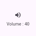 |
| cupertino.GlowingOverscrollIndicator.2 | This example demonstrates how to use a [NestedScrollView] to manipulate the placement of a [GlowingOverscrollIndicator] when building a [CustomScrollView]. Drag the scrollable to see the bounds of the overscroll indicator. |
| material.InputDecoration.2 | This sample shows how to style a "collapsed" `TextField` using an `InputDecorator`. The collapsed `TextField` surrounds the hint text and input area with a border, but does not add padding around them. 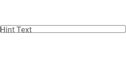 |
| cupertino.FractionallySizedBox.1 | This sample shows a [FractionallySizedBox] whose one child is 50% of the box's size per the width and height factor parameters, and centered within that box by the alignment parameter. |
| cupertino.ScrollMetricsNotification.1 | This sample shows how a [ScrollMetricsNotification] is dispatched when the `windowSize` is changed. Press the floating action button to increase the scrollable window's size. |
| widgets.Dismissible.1 | This sample shows how you can use the [Dismissible] widget to remove list items using swipe gestures. Swipe any of the list tiles to the left or right to dismiss them from the [ListView]. |
| material.ThemeExtension.1 | This sample shows how to create and use a subclass of [ThemeExtension] that defines two colors. |
| widgets.SizeTransition.1 | This code defines a widget that uses [SizeTransition] to change the size of [FlutterLogo] continually. It is built with a [Scaffold] where the internal widget has space to change its size. |
| widgets.LogicalKeySet.1 | In the following example, the counter is increased when the following key sequences are pressed: * Control left, then C. * Control right, then C. * C, then Control left. But not when: * Control left, then A, then C. |
| widgets.Image.errorBuilder.1 | The following sample uses [errorBuilder] to show a '😢' in place of the image that fails to load, and prints the error to the console. |
| cupertino.FocusNode.1 | This example shows how a FocusNode should be managed if not using the [Focus] or [FocusScope] widgets. See the [Focus] widget for a similar example using [Focus] and [FocusScope] widgets. |
| material.ScaffoldMessenger.1 | Here is an example of showing a [SnackBar] when the user presses a button. |
| material.Tooltip.1 | This example show a basic [Tooltip] which has a [Text] as child. [message] contains your label to be shown by the tooltip when the child that Tooltip wraps is hovered over on web or desktop. On mobile, the tooltip is shown when the widget is long pressed. |
| cupertino.AnimatedAlign.1 | The following code implements the [AnimatedAlign] widget, using a [curve] of [Curves.fastOutSlowIn]. |
| material.InputDecoration.suffixIconConstraints.1 | This example shows the differences between two `TextField` widgets when [suffixIconConstraints] is set to the default value and when one is not. Note that [isDense] must be set to true to be able to set the constraints smaller than 48px. If null, [BoxConstraints] with a minimum width and height of 48px is used. |
| material.InputDecoration.1 | This sample shows how to style a `TextField` using an `InputDecorator`. The TextField displays a "send message" icon to the left of the input area, which is surrounded by a border an all sides. It displays the `hintText` inside the input area to help the user understand what input is required. It displays the `helperText` and `counterText` below the input area. 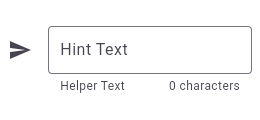 |
| cupertino.FutureBuilder.1 | This sample shows a [FutureBuilder] that displays a loading spinner while it loads data. It displays a success icon and text if the [Future] completes with a result, or an error icon and text if the [Future] completes with an error. Assume the `_calculation` field is set by pressing a button elsewhere in the UI. |
| material.InputDecoration.5 | This sample shows how to style a `TextField` with a prefixIcon that changes color based on the `MaterialState`. The color defaults to gray, be blue while focused and red if in an error state. |
| widgets.IgnorePointer.1 | The following sample has an [IgnorePointer] widget wrapping the `Column` which contains a button. When [ignoring] is set to `true` anything inside the `Column` can not be tapped. When [ignoring] is set to `false` anything inside the `Column` can be tapped. |
| cupertino.SliverFillRemaining.2 | In this sample the [SliverFillRemaining] defers to the size of its [child] because the child's extent exceeds that of the remaining extent of the viewport's main axis. |
| widgets.MouseRegion.onExit.2 | The following example shows a widget that hides its content one second after being hovered, and also exposes the enter and exit callbacks. Because the widget conditionally creates the `MouseRegion`, and leaks the hover state, it needs to take the restriction into consideration. In this case, since it has access to the event that triggers the disappearance of the `MouseRegion`, it simply trigger the exit callback during that event as well. |
| cupertino.Actions.1 | This example creates a custom [Action] subclass `ModifyAction` for modifying a model, and another, `SaveAction` for saving it. This example demonstrates passing arguments to the [Intent] to be carried to the [Action]. Actions can get data either from their own construction (like the `model` in this example), or from the intent passed to them when invoked (like the increment `amount` in this example). This example also demonstrates how to use Intents to limit a widget's dependencies on its surroundings. The `SaveButton` widget defined in this example can invoke actions defined in its ancestor widgets, which can be customized to match the part of the widget tree that it is in. It doesn't need to know about the `SaveAction` class, only the `SaveIntent`, and it only needs to know about a value notifier, not the entire model. |
| widgets.showGeneralDialog.1 | This sample demonstrates how to create a restorable dialog. This is accomplished by enabling state restoration by specifying [WidgetsApp.restorationScopeId] and using [Navigator.restorablePush] to push [RawDialogRoute] when the button is tapped. {@macro flutter.widgets.RestorationManager} |
| material.AnimatedSlide.1 | This code defines a widget that uses [AnimatedSlide] to translate a [FlutterLogo] up or down by the amount of it's height with each press of the corresponding button. |
| cupertino.AspectRatio.3 | |
| material.Form.1 | This example shows a [Form] with one [TextFormField] to enter an email address and an [ElevatedButton] to submit the form. A [GlobalKey] is used here to identify the [Form] and validate input. 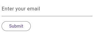 |
| material.DataTable.1 | This sample shows how to display a [DataTable] with three columns: name, age, and role. The columns are defined by three [DataColumn] objects. The table contains three rows of data for three example users, the data for which is defined by three [DataRow] objects. 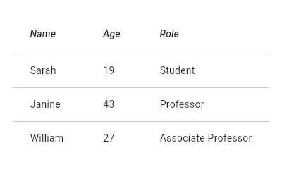 |
| widgets.AbsorbPointer.1 | The following sample has an [AbsorbPointer] widget wrapping the button on top of the stack, which absorbs pointer events, preventing its child button __and__ the button below it in the stack from receiving the pointer events. |
| material.Checkbox.1 | This example shows how you can override the default theme of of a [Checkbox] with a [MaterialStateProperty]. In this example, the checkbox's color will be `Colors.blue` when the [Checkbox] is being pressed, hovered, or focused. Otherwise, the checkbox's color will be `Colors.red`. |
| material.RadioListTile.2 |  Here is an example of a custom labeled radio widget, called LinkedLabelRadio, that includes an interactive [RichText] widget that handles tap gestures. |
| cupertino.GestureDetector.1 | This example contains a black light bulb wrapped in a [GestureDetector]. It turns the light bulb yellow when the "TURN LIGHT ON" button is tapped by setting the `_lights` field, and off again when "TURN LIGHT OFF" is tapped. |
| material.AnimatedList.1 | This sample application uses an [AnimatedList] to create an effect when items are removed or added to the list. |
| dart.dart_ui.FontFeature.historicalForms.1 | The Cardo font supports the `hist` feature specifically for the letter "s": it changes occurrences of that letter for the glyph used by U+017F LATIN SMALL LETTER LONG S. 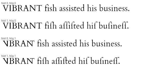 |
| material.Tooltip.4 | This example shows how [Tooltip] can be shown manually with [TooltipTriggerMode.manual] by calling the [TooltipState.ensureTooltipVisible] function. |
| material.AlignTransition.1 | The following code implements the [AlignTransition] as seen in the video above: |
| widgets.MouseRegion.1 | This example makes a [Container] react to being entered by a mouse pointer, showing a count of the number of entries and exits. |
| material.ScaffoldMessengerState.showMaterialBanner.1 | Here is an example of showing a [MaterialBanner] when the user presses a button. |
| widgets.FocusTraversalGroup.1 | This sample shows three rows of buttons, each grouped by a [FocusTraversalGroup], each with different traversal order policies. Use tab traversal to see the order they are traversed in. The first row follows a numerical order, the second follows a lexical order (ordered to traverse right to left), and the third ignores the numerical order assigned to it and traverses in widget order. |
| cupertino.Focus.3 | This example shows how to focus a newly-created widget immediately after it is created. The focus node will not actually be given the focus until after the frame in which it has requested focus is drawn, so it is OK to call [FocusNode.requestFocus] on a node which is not yet in the focus tree. |
| material.Tooltip.3 | This example shows a rich [Tooltip] that specifies the [richMessage] parameter instead of the [message] parameter (only one of these may be non-null. Any [InlineSpan] can be specified for the [richMessage] attribute, including [WidgetSpan]. |
| material.NestedScrollView.1 | This example shows a [NestedScrollView] whose header is the combination of a [TabBar] in a [SliverAppBar] and whose body is a [TabBarView]. It uses a [SliverOverlapAbsorber]/[SliverOverlapInjector] pair to make the inner lists align correctly, and it uses [SafeArea] to avoid any horizontal disturbances (e.g. the "notch" on iOS when the phone is horizontal). In addition, [PageStorageKey]s are used to remember the scroll position of each tab's list. |
| material.FocusableActionDetector.1 | This example shows how keyboard interaction can be added to a custom control that changes color when hovered and focused, and can toggle a light when activated, either by touch or by hitting the `X` key on the keyboard when the "And Me" button has the keyboard focus (be sure to use TAB to move the focus to the "And Me" button before trying it out). This example defines its own key binding for the `X` key, but in this case, there is also a default key binding for [ActivateAction] in the default key bindings created by [WidgetsApp] (the parent for [MaterialApp], and [CupertinoApp]), so the `ENTER` key will also activate the buttons. |
| cupertino.AlignTransition.1 | The following code implements the [AlignTransition] as seen in the video above: |
| widgets.Navigator.restorablePush.1 | Typical usage is as follows: |
| cupertino.RestorableRouteFuture.1 | This example uses a [RestorableRouteFuture] in the `_MyHomeState` to push a new `MyCounter` route and to retrieve its return value. |
| widgets.RestorableRouteFuture.1 | This example uses a [RestorableRouteFuture] in the `_MyHomeState` to push a new `MyCounter` route and to retrieve its return value. |
| material.RawScrollbar.1 | This sample shows an app with two scrollables in the same route. Since by default, there is one [PrimaryScrollController] per route, and they both have a scroll direction of [Axis.vertical], they would both try to attach to that controller. The [Scrollbar] cannot support multiple positions attached to the same controller, so one [ListView], and its [Scrollbar] have been provided a unique [ScrollController]. Alternatively, a new PrimaryScrollController could be created above one of the [ListView]s. |
| cupertino.CupertinoPicker.1 | This example shows a [CupertinoPicker] that displays a list of fruits on a wheel for selection. |
| material.FocusNode.1 | This example shows how a FocusNode should be managed if not using the [Focus] or [FocusScope] widgets. See the [Focus] widget for a similar example using [Focus] and [FocusScope] widgets. |
| widgets.CustomMultiChildLayout.1 | This example shows a [CustomMultiChildLayout] widget being used to lay out colored blocks from start to finish in a cascade that has some overlap. It responds to changes in [Directionality] by re-laying out its children. |
| cupertino.Focus.1 | This example shows how to manage focus using the [Focus] and [FocusScope] widgets. See [FocusNode] for a similar example that doesn't use [Focus] or [FocusScope]. |
| widgets.MediaQueryData.systemGestureInsets.1 | For apps that might be deployed on Android Q devices with full gesture navigation enabled, use [systemGestureInsets] with [Padding] to avoid having the left and right edges of the [Slider] from appearing within the area reserved for system gesture navigation. By default, [Slider]s expand to fill the available width. So, we pad the left and right sides. |
| material.FadeTransition.1 | The following code implements the [FadeTransition] using the Flutter logo: |
| widgets.Image.loadingBuilder.1 | The following sample uses [loadingBuilder] to show a [CircularProgressIndicator] while an image loads over the network. |
| material.SliverGridDelegateWithFixedCrossAxisCount.1 | Here is an example using the [childAspectRatio] property. On a device with a screen width of 800.0, it creates a GridView with each tile with a width of 200.0 and a height of 100.0. |
| dart.dart_ui.FontFeature.historicalLigatures.1 | The Cardo font supports the `hlig` feature. It has legacy ligatures for "VI" and "NT", and various ligatures involving the "long s". In the example below, both historical forms (`hist 1`) and historical ligatures (`hlig 1`) are enabled, so, for instance, "fish" becomes "fiſh" which is then rendered using a ligature for the last two characters. Similarly, the word "business" is turned into "buſineſſ" by `hist`, and the `ſi` and `ſſ` pairs are ligated by `hlig`. Observe in particular the position of the dot of the "i" in "business" in the various combinations of these features.  |
| cupertino.ScaleTransition.1 | The following code implements the [ScaleTransition] as seen in the video above: |
| material.DropdownButton.style.1 | This sample shows a `DropdownButton` with a dropdown button text style that is different than its menu items. |
| material.PlatformMenuBar.1 | This example shows a [PlatformMenuBar] that contains a single top level menu, containing three items for "About", a toggleable menu item for showing a message, a cascading submenu with message choices, and "Quit". **This example will only work on macOS.** |
| material.ScaffoldState.showSnackBar.1 | Here is an example of showing a [SnackBar] when the user presses a button. |
| cupertino.CupertinoButton.1 | This sample shows produces an enabled and disabled [CupertinoButton] and [CupertinoButton.filled]. |
| material.RestorableRouteFuture.1 | This example uses a [RestorableRouteFuture] in the `_MyHomeState` to push a new `MyCounter` route and to retrieve its return value. |
| widgets.OrderedTraversalPolicy.1 | This sample shows how to assign a traversal order to a widget. In the example, the focus order goes from bottom right (the "One" button) to top left (the "Six" button). |
| services.MouseCursor.1 | This sample creates a rectangular region that is wrapped by a [MouseRegion] with a system mouse cursor. The mouse pointer becomes an I-beam when hovering over the region. |
| cupertino.SliverFadeTransition.1 | Creates a [CustomScrollView] with a [SliverFixedExtentList] that uses a [SliverFadeTransition] to fade the list in and out. |
| widgets.GridView.4 | This example shows a custom implementation of [ListTile] selection in a [GridView] or [ListView]. Long press any ListTile to enable selection mode. |
| material.InheritedNotifier.1 | This example shows three spinning squares that use the value of the notifier on an ancestor [InheritedNotifier] (`SpinModel`) to give them their rotation. The [InheritedNotifier] doesn't need to know about the children, and the `notifier` argument doesn't need to be an animation controller, it can be anything that implements [Listenable] (like a [ChangeNotifier]). The `SpinModel` class could just as easily listen to another object (say, a separate object that keeps the value of an input or data model value) that is a [Listenable], and get the value from that. The descendants also don't need to have an instance of the [InheritedNotifier] in order to use it, they just need to know that there is one in their ancestry. This can help with decoupling widgets from their models. |
| material.SharedAppData.2 | The following sample demonstrates how a single lazily computed value could be shared within an app. A Flutter package that provided custom widgets might use this approach to share a (possibly private) value with instances of those widgets. |
| widgets.ScaleTransition.1 | The following code implements the [ScaleTransition] as seen in the video above: |
| widgets.ScrollMetricsNotification.1 | This sample shows how a [ScrollMetricsNotification] is dispatched when the `windowSize` is changed. Press the floating action button to increase the scrollable window's size. |
| material.DeletableChipAttributes.onDeleted.1 | This sample shows how to use [onDeleted] to remove an entry when the delete button is tapped. |
| cupertino.Focus.2 | This example shows how to wrap another widget in a [Focus] widget to make it focusable. It wraps a [Container], and changes the container's color when it is set as the [FocusManager.primaryFocus]. If you also want to handle mouse hover and/or keyboard actions on a widget, consider using a [FocusableActionDetector], which combines several different widgets to provide those capabilities. |
| material.ReorderableListView.1 | |
| cupertino.RestorableValue.1 | A [StatefulWidget] that has a restorable [int] property. |
| rendering.SliverGridDelegateWithFixedCrossAxisCount.2 | Here is an example using the [mainAxisExtent] property. On a device with a screen width of 800.0, it creates a GridView with each tile with a width of 200.0 and a height of 150.0. |
| widgets.AnimatedBuilder.2 | The following example implements a simple counter that utilizes an [AnimatedBuilder] to limit rebuilds to only the [Text] widget. The current count is stored in a [ValueNotifier], which rebuilds the [AnimatedBuilder]'s contents when its value is changed. |
| material.FlexibleSpaceBar.1 | This sample application demonstrates the different features of the [FlexibleSpaceBar] when used in a [SliverAppBar]. This app bar is configured to stretch into the overscroll space, and uses the [FlexibleSpaceBar.stretchModes] to apply `fadeTitle`, `blurBackground` and `zoomBackground`. The app bar also makes use of [CollapseMode.parallax] by default. |
| material.FutureBuilder.1 | This sample shows a [FutureBuilder] that displays a loading spinner while it loads data. It displays a success icon and text if the [Future] completes with a result, or an error icon and text if the [Future] completes with an error. Assume the `_calculation` field is set by pressing a button elsewhere in the UI. |
| material.showDialog.1 | This sample demonstrates how to create a restorable Material dialog. This is accomplished by enabling state restoration by specifying [MaterialApp.restorationScopeId] and using [Navigator.restorablePush] to push [DialogRoute] when the button is tapped. {@macro flutter.widgets.RestorationManager} |
| material.AppBar.1 | This sample shows an [AppBar] with two simple actions. The first action opens a [SnackBar], while the second action navigates to a new page. |
| rendering.MouseCursor.1 | This sample creates a rectangular region that is wrapped by a [MouseRegion] with a system mouse cursor. The mouse pointer becomes an I-beam when hovering over the region. |
| material.Table.1 | This sample shows a `Table` with borders, multiple types of column widths and different vertical cell alignments. |
| material.ElevatedButton.1 | This sample produces an enabled and a disabled ElevatedButton. |
| material.AnimatedPadding.1 | The following code implements the [AnimatedPadding] widget, using a [curve] of [Curves.easeInOut]. |
| cupertino.CupertinoTextFormFieldRow.2 | This example shows how to move the focus to the next field when the user presses the SPACE key. |
| material.Scaffold.drawer.1 | To disable the drawer edge swipe, set the [Scaffold.drawerEnableOpenDragGesture] to false. Then, use [ScaffoldState.openDrawer] to open the drawer and [Navigator.pop] to close it. |
| widgets.SingleActivator.SingleActivator.1 | In the following example, the shortcut `Control + C` increases the counter: |
| material.SliverAnimatedOpacity.1 | Creates a [CustomScrollView] with a [SliverFixedExtentList] and a [FloatingActionButton]. Pressing the button animates the lists' opacity. |
| material.PhysicalShape.1 | This example shows how to use a [PhysicalShape] on a centered [SizedBox] to clip it to a rounded rectangle using a [ShapeBorderClipper] and give it an orange color along with a shadow. |
| material.ButtonStyle.1 | This sample shows how to create each of the Material 3 button types with Flutter. |
| widgets.Focus.2 | This example shows how to wrap another widget in a [Focus] widget to make it focusable. It wraps a [Container], and changes the container's color when it is set as the [FocusManager.primaryFocus]. If you also want to handle mouse hover and/or keyboard actions on a widget, consider using a [FocusableActionDetector], which combines several different widgets to provide those capabilities. |
| widgets.GlowingOverscrollIndicator.1 | This example demonstrates how to use a [NotificationListener] to manipulate the placement of a [GlowingOverscrollIndicator] when building a [CustomScrollView]. Drag the scrollable to see the bounds of the overscroll indicator. |
| cupertino.PhysicalShape.1 | This example shows how to use a [PhysicalShape] on a centered [SizedBox] to clip it to a rounded rectangle using a [ShapeBorderClipper] and give it an orange color along with a shadow. |
| widgets.Focus.1 | This example shows how to manage focus using the [Focus] and [FocusScope] widgets. See [FocusNode] for a similar example that doesn't use [Focus] or [FocusScope]. |
| material.DefaultTextStyleTransition.1 | The following code implements the [DefaultTextStyleTransition] that shows a transition between thick blue font and thin red font. |
| material.InputDecoration.suffixIcon.1 | This example shows how the suffix icon alignment can be changed using [Align] with a fixed `widthFactor` and `heightFactor`. |
| material.Expanded.1 | This example shows how to use an [Expanded] widget in a [Column] so that its middle child, a [Container] here, expands to fill the space. 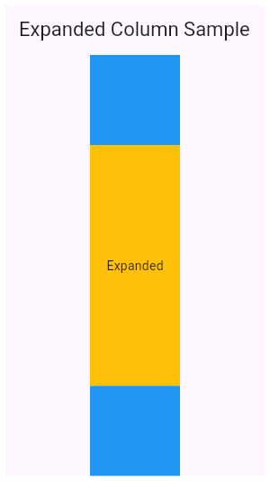 |
| widgets.RelativePositionedTransition.1 | The following code implements the [RelativePositionedTransition] as seen in the video above: |
| cupertino.InheritedTheme.1 | This example demonstrates how `InheritedTheme.capture()` can be used to wrap the contents of a new route with the inherited themes that are present when the route was built - but are not present when route is actually shown. If the same code is run without `InheritedTheme.capture(), the new route's Text widget will inherit the "something must be wrong" fallback text style, rather than the default text style defined in MyApp. |
| material.MaterialBanner.2 | MaterialBanner's can also be presented through a [ScaffoldMessenger]. Here is an example where ScaffoldMessengerState.showMaterialBanner() is used to show the MaterialBanner. |
| material.RawScrollbar.2 | This sample shows a [RawScrollbar] that executes a fade animation as scrolling occurs. The RawScrollbar will fade into view as the user scrolls, and fade out when scrolling stops. The [GridView] uses the [PrimaryScrollController] since it has an [Axis.vertical] scroll direction and has not been provided a [ScrollController]. |
| cupertino.StreamBuilder.1 | This sample shows a [StreamBuilder] that listens to a Stream that emits bids for an auction. Every time the StreamBuilder receives a bid from the Stream, it will display the price of the bid below an icon. If the Stream emits an error, the error is displayed below an error icon. When the Stream finishes emitting bids, the final price is displayed. |
| material.RawAutocomplete.1 | This example shows how to create a very basic autocomplete widget using the [fieldViewBuilder] and [optionsViewBuilder] parameters. |
| widgets.SharedAppData.1 | The following sample demonstrates using the automatically created `SharedAppData`. Button presses cause changes to the values for keys 'foo', and 'bar', and those changes only cause the widgets that depend on those keys to be rebuilt. |
| widgets.AnimatedWidget.1 | This code defines a widget called `Spinner` that spins a green square continually. It is built with an [AnimatedWidget]. |
| cupertino.CupertinoTabBar.1 | This example shows a [CupertinoTabBar] placed in a [CupertinoTabScaffold]. |
| widgets.ActionListener.1 | This example shows how ActionListener handles adding and removing of the [listener] in the widget lifecycle. |
| cupertino.DecoratedBoxTransition.1 | The following code implements the [DecoratedBoxTransition] as seen in the video above: |
| material.Scrollbar.1 | This sample shows a [Scrollbar] that executes a fade animation as scrolling occurs. The Scrollbar will fade into view as the user scrolls, and fade out when scrolling stops. |
| material.SliverFillRemaining.3 | In this sample the [SliverFillRemaining] defers to the size of its [child] because the [SliverConstraints.precedingScrollExtent] has gone beyond that of the viewport's main axis. |
| material.AlertDialog.2 | This demo shows a [TextButton] which when pressed, calls [showDialog]. When called, this method displays a Material dialog above the current contents of the app and returns a [Future] that completes when the dialog is dismissed. |
| cupertino.SizeTransition.1 | This code defines a widget that uses [SizeTransition] to change the size of [FlutterLogo] continually. It is built with a [Scaffold] where the internal widget has space to change its size. |
| material.PopupMenuButton.1 | This example shows a menu with four items, selecting between an enum's values and setting a `_selectedMenu` field based on the selection |
| material.Notification.1 | This example shows a [NotificationListener] widget that listens for [ScrollNotification] notifications. When a scroll event occurs in the [NestedScrollView], this widget is notified. The events could be either a [ScrollStartNotification]or[ScrollEndNotification]. |
| material.AnimatedBuilder.1 | This code defines a widget that spins a green square continually. It is built with an [AnimatedBuilder] and makes use of the [child] feature to avoid having to rebuild the [Container] each time. |
| widgets.ErrorWidget.1 | This example shows how to override the standard error widget builder in release mode, but use the standard one in debug mode. The error occurs when you click the "Error Prone" button. |
| material.Scaffold.1 | This example shows a [Scaffold] with a [body] and [FloatingActionButton]. The [body] is a [Text] placed in a [Center] in order to center the text within the [Scaffold]. The [FloatingActionButton] is connected to a callback that increments a counter. 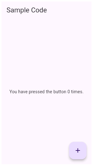 |
| chip.DeletableChipAttributes.onDeleted.1 | This sample shows how to use [onDeleted] to remove an entry when the delete button is tapped. |
| material.NestedScrollViewState.1 | [NestedScrollViewState] can be obtained using a [GlobalKey]. Using the following setup, you can access the inner scroll controller using `globalKey.currentState.innerController`. |
| material.Scaffold.of.2 | When the [Scaffold] is actually created in the same `build` function, the `context` argument to the `build` function can't be used to find the [Scaffold] (since it's "above" the widget being returned in the widget tree). In such cases, the following technique with a [Builder] can be used to provide a new scope with a [BuildContext] that is "under" the [Scaffold]: |
| widgets.PlatformMenuBar.1 | This example shows a [PlatformMenuBar] that contains a single top level menu, containing three items for "About", a toggleable menu item for showing a message, a cascading submenu with message choices, and "Quit". **This example will only work on macOS.** |
| cupertino.SliverGridDelegateWithFixedCrossAxisCount.2 | Here is an example using the [mainAxisExtent] property. On a device with a screen width of 800.0, it creates a GridView with each tile with a width of 200.0 and a height of 150.0. |
| cupertino.CupertinoPageScaffold.1 | This example shows a [CupertinoPageScaffold] with a [ListView] as a [child]. The [CupertinoButton] is connected to a callback that increments a counter. The [backgroundColor] can be changed. |
| material.ActionListener.1 | This example shows how ActionListener handles adding and removing of the [listener] in the widget lifecycle. |
| material.BottomNavigationBar.2 | This example shows a [BottomNavigationBar] as it is used within a [Scaffold] widget. The [BottomNavigationBar] has four [BottomNavigationBarItem] widgets, which means it defaults to [BottomNavigationBarType.shifting], and the [currentIndex] is set to index 0. The selected item is amber in color. With each [BottomNavigationBarItem] widget, backgroundColor property is also defined, which changes the background color of [BottomNavigationBar], when that item is selected. The `_onItemTapped` function changes the selected item's index and displays a corresponding message in the center of the [Scaffold]. |
| material.ExpansionPanelList.1 | Here is a simple example of how to implement ExpansionPanelList. |
| material.Card.1 | This sample shows creation of a [Card] widget that shows album information and two actions. |
| dart.dart_ui.FontFeature.contextualAlternates.1 | The Barriecito font supports the `calt` feature. It causes some letters in close proximity to other instances of themselves to use different glyphs, to give the appearance of more variation in the glyphs, rather than having each letter always use a particular glyph.  |
| cupertino.SlottedMultiChildRenderObjectWidgetMixin.1 | This example uses the [SlottedMultiChildRenderObjectWidgetMixin] in combination with the [SlottedContainerRenderObjectMixin] to implement a widget that provides two slots: topLeft and bottomRight. The widget arranges the children in those slots diagonally. |
| widgets.Image.frameBuilder.1 | The following sample demonstrates how to use this builder to implement an image that fades in once it's been loaded. This sample contains a limited subset of the functionality that the [FadeInImage] widget provides out of the box. |
| cupertino.Offstage.1 | This example shows a [FlutterLogo] widget when the `_offstage` member field is false, and hides it without any room in the parent when it is true. When offstage, this app displays a button to get the logo size, which will be displayed in a [SnackBar]. |
| cupertino.TweenAnimationBuilder.1 | This example shows an [IconButton] that "zooms" in when the widget first builds (its size smoothly increases from 0 to 24) and whenever the button is pressed, it smoothly changes its size to the new target value of either 48 or 24. |
| widgets.PageStorage.1 | This sample shows how to explicitly use a [PageStorage] to store the states of its children pages. Each page includes a scrollable list, whose position is preserved when switching between the tabs thanks to the help of [PageStorageKey]. |
| cupertino.BuildOwner.1 | This example shows how to build an off-screen widget tree used to measure the layout size of the rendered tree. For some use cases, the simpler [Offstage] widget may be a better alternative to this approach. |
| material.FittedBox.1 | In this example, the image is stretched to fill the entire [Container], which would not happen normally without using FittedBox. |
| widgets.TweenAnimationBuilder.1 | This example shows an [IconButton] that "zooms" in when the widget first builds (its size smoothly increases from 0 to 24) and whenever the button is pressed, it smoothly changes its size to the new target value of either 48 or 24. |
| material.Ink.3 | Wrapping the [Ink] in a clipping widget directly will not work since the [Material] it will be printed on is responsible for clipping. In this example the image is not being clipped as expected. This is because it is being rendered onto the Scaffold body Material, which isn't wrapped in the [ClipRRect]. |
| cupertino.Expanded.1 | This example shows how to use an [Expanded] widget in a [Column] so that its middle child, a [Container] here, expands to fill the space.  |
| dart.dart_ui.FontFeature.scientificInferiors.1 | The Piazzolla font supports the `sinf` feature. It causes digits to be smaller and subscripted.  |
| material.LogicalKeySet.1 | In the following example, the counter is increased when the following key sequences are pressed: * Control left, then C. * Control right, then C. * C, then Control left. But not when: * Control left, then A, then C. |
| material.FloatingActionButton.1 | This example shows how to display a [FloatingActionButton] in a [Scaffold], with a pink [backgroundColor] and a thumbs up [Icon]. 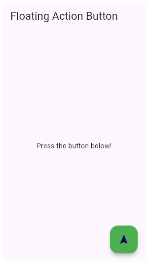 |
| cupertino.showCupertinoModalPopup.1 | This sample demonstrates how to create a restorable Cupertino modal route. This is accomplished by enabling state restoration by specifying [CupertinoApp.restorationScopeId] and using [Navigator.restorablePush] to push [CupertinoModalPopupRoute] when the [CupertinoButton] is tapped. {@macro flutter.widgets.RestorationManager} |
| material.RelativePositionedTransition.1 | The following code implements the [RelativePositionedTransition] as seen in the video above: |
| cupertino.SliverAnimatedList.1 | This sample application uses a [SliverAnimatedList] to create an animated effect when items are removed or added to the list. |
| material.ScrollMetricsNotification.1 | This sample shows how a [ScrollMetricsNotification] is dispatched when the `windowSize` is changed. Press the floating action button to increase the scrollable window's size. |
| material.MaterialBanner.1 | Banners placed directly into the widget tree are static. |
| material.Tooltip.2 | This example covers most of the attributes available in Tooltip. `decoration` has been used to give a gradient and borderRadius to Tooltip. `height` has been used to set a specific height of the Tooltip. `preferBelow` is false, the tooltip will prefer showing above [Tooltip]'s child widget. However, it may show the tooltip below if there's not enough space above the widget. `textStyle` has been used to set the font size of the 'message'. `showDuration` accepts a Duration to continue showing the message after the long press has been released or the mouse pointer exits the child widget. `waitDuration` accepts a Duration for which a mouse pointer has to hover over the child widget before the tooltip is shown. |
| widgets.DefaultTextStyleTransition.1 | The following code implements the [DefaultTextStyleTransition] that shows a transition between thick blue font and thin red font. |
| cupertino.showGeneralDialog.1 | This sample demonstrates how to create a restorable dialog. This is accomplished by enabling state restoration by specifying [WidgetsApp.restorationScopeId] and using [Navigator.restorablePush] to push [RawDialogRoute] when the button is tapped. {@macro flutter.widgets.RestorationManager} |
| widgets.RawScrollbar.3 | When `thumbVisibility` is true, the scrollbar thumb will remain visible without the fade animation. This requires that a [ScrollController] is provided to `controller` for both the [RawScrollbar] and the [GridView]. Alternatively, the [PrimaryScrollController] can be used automatically so long as it is attached to the singular [ScrollPosition] associated with the GridView. |
| cupertino.CustomMultiChildLayout.1 | This example shows a [CustomMultiChildLayout] widget being used to lay out colored blocks from start to finish in a cascade that has some overlap. It responds to changes in [Directionality] by re-laying out its children. |
| material.MaterialStateMouseCursor.1 | This example defines a mouse cursor that resolves to [SystemMouseCursors.forbidden] when its widget is disabled. |
| widgets.GestureDetector.1 | This example contains a black light bulb wrapped in a [GestureDetector]. It turns the light bulb yellow when the "TURN LIGHT ON" button is tapped by setting the `_lights` field, and off again when "TURN LIGHT OFF" is tapped. |
| cupertino.FittedBox.1 | In this example, the image is stretched to fill the entire [Container], which would not happen normally without using FittedBox. |
| material.SingleChildScrollView.1 | In this example, the children are spaced out equally, unless there's no more room, in which case they stack vertically and scroll. When using this technique, [Expanded] and [Flexible] are not useful, because in both cases the "available space" is infinite (since this is in a viewport). The next section describes a technique for providing a maximum height constraint. |
| material.ListTile.5 | Here is an example of a custom list item that resembles a YouTube-related video list item created with [Expanded] and [Container] widgets.  |
| widgets.AnimatedList.1 | This sample application uses an [AnimatedList] to create an effect when items are removed or added to the list. |
| material.SnackBar.2 | Here is an example of a customized [SnackBar]. It utilizes [behavior], [shape], [padding], [width], and [duration] to customize the location, appearance, and the duration for which the [SnackBar] is visible. |
| widgets.AutofillGroup.1 | An example form with autofillable fields grouped into different `AutofillGroup`s. |
| material.RawAutocomplete.3 | This example shows the use of RawAutocomplete in a form. |
| widgets.AnimatedPadding.1 | The following code implements the [AnimatedPadding] widget, using a [curve] of [Curves.easeInOut]. |
| material.AspectRatio.2 | |
| cupertino.showCupertinoDialog.1 | This sample demonstrates how to create a restorable Cupertino dialog. This is accomplished by enabling state restoration by specifying [CupertinoApp.restorationScopeId] and using [Navigator.restorablePush] to push [CupertinoDialogRoute] when the [CupertinoButton] is tapped. {@macro flutter.widgets.RestorationManager} |
| material.Offstage.1 | This example shows a [FlutterLogo] widget when the `_offstage` member field is false, and hides it without any room in the parent when it is true. When offstage, this app displays a button to get the logo size, which will be displayed in a [SnackBar]. |
| cupertino.AspectRatio.2 | |
| cupertino.MouseCursor.1 | This sample creates a rectangular region that is wrapped by a [MouseRegion] with a system mouse cursor. The mouse pointer becomes an I-beam when hovering over the region. |
| widgets.RawScrollbar.1 | This sample shows an app with two scrollables in the same route. Since by default, there is one [PrimaryScrollController] per route, and they both have a scroll direction of [Axis.vertical], they would both try to attach to that controller. The [Scrollbar] cannot support multiple positions attached to the same controller, so one [ListView], and its [Scrollbar] have been provided a unique [ScrollController]. Alternatively, a new PrimaryScrollController could be created above one of the [ListView]s. |
| widgets.SliverGridDelegateWithFixedCrossAxisCount.1 | Here is an example using the [childAspectRatio] property. On a device with a screen width of 800.0, it creates a GridView with each tile with a width of 200.0 and a height of 100.0. |
| focus_manager.FocusNode.unfocus.1 | This example shows the difference between the different [UnfocusDisposition] values for [unfocus]. Try setting focus on the four text fields by selecting them, and then select "UNFOCUS" to see what happens when the current [FocusManager.primaryFocus] is unfocused. Try pressing the TAB key after unfocusing to see what the next widget chosen is. |
| cupertino.PageView.1 | Here is an example of [PageView]. It creates a centered [Text] in each of the three pages which scroll horizontally. |
| dart.dart_ui.FontFeature.ordinalForms.1 | The Piazzolla font supports the `ordn` feature. It causes alphabetic glyphs to become smaller and superscripted.  |
| material.DropdownButton.1 | This sample shows a `DropdownButton` with a large arrow icon, purple text style, and bold purple underline, whose value is one of "One", "Two", "Free", or "Four".  |
| material.SlottedMultiChildRenderObjectWidgetMixin.1 | This example uses the [SlottedMultiChildRenderObjectWidgetMixin] in combination with the [SlottedContainerRenderObjectMixin] to implement a widget that provides two slots: topLeft and bottomRight. The widget arranges the children in those slots diagonally. |
| material.AspectRatio.3 | |
| material.ScaffoldMessenger.of.2 | Sometimes [SnackBar]s are produced by code that doesn't have ready access to a valid [BuildContext]. One such example of this is when you show a SnackBar from a method outside of the `build` function. In these cases, you can assign a [GlobalKey] to the [ScaffoldMessenger]. This example shows a key being used to obtain the [ScaffoldMessengerState] provided by the [MaterialApp]. |
| widgets.FittedBox.1 | In this example, the image is stretched to fill the entire [Container], which would not happen normally without using FittedBox. |
| widgets.Expanded.1 | This example shows how to use an [Expanded] widget in a [Column] so that its middle child, a [Container] here, expands to fill the space.  |
| widgets.NestedScrollView.1 | This example shows a [NestedScrollView] whose header is the combination of a [TabBar] in a [SliverAppBar] and whose body is a [TabBarView]. It uses a [SliverOverlapAbsorber]/[SliverOverlapInjector] pair to make the inner lists align correctly, and it uses [SafeArea] to avoid any horizontal disturbances (e.g. the "notch" on iOS when the phone is horizontal). In addition, [PageStorageKey]s are used to remember the scroll position of each tab's list. |
| material.RawScrollbar.3 | When `thumbVisibility` is true, the scrollbar thumb will remain visible without the fade animation. This requires that a [ScrollController] is provided to `controller` for both the [RawScrollbar] and the [GridView]. Alternatively, the [PrimaryScrollController] can be used automatically so long as it is attached to the singular [ScrollPosition] associated with the GridView. |
| material.MaterialStateProperty.1 | This example shows how you can override the default text and icon color (the "foreground color") of a [TextButton] with a [MaterialStateProperty]. In this example, the button's text color will be `Colors.blue` when the button is being pressed, hovered, or focused. Otherwise, the text color will be `Colors.red`. |
| rendering.SliverGridDelegateWithFixedCrossAxisCount.1 | Here is an example using the [childAspectRatio] property. On a device with a screen width of 800.0, it creates a GridView with each tile with a width of 200.0 and a height of 100.0. |
| material.TextField.2 | This sample shows how to get a value from a TextField via the [onSubmitted] callback. |
| material.RefreshIndicator.1 | This example shows how [RefreshIndicator] can be triggered in different ways. |
| material.BuildOwner.1 | This example shows how to build an off-screen widget tree used to measure the layout size of the rendered tree. For some use cases, the simpler [Offstage] widget may be a better alternative to this approach. |
| widgets.RawAutocomplete.1 | This example shows how to create a very basic autocomplete widget using the [fieldViewBuilder] and [optionsViewBuilder] parameters. |
| material.ListTile.6 | Here is an example of an article list item with multiline titles and subtitles. It utilizes [Row]s and [Column]s, as well as [Expanded] and [AspectRatio] widgets to organize its layout.  |
| widgets.SlottedMultiChildRenderObjectWidgetMixin.1 | This example uses the [SlottedMultiChildRenderObjectWidgetMixin] in combination with the [SlottedContainerRenderObjectMixin] to implement a widget that provides two slots: topLeft and bottomRight. The widget arranges the children in those slots diagonally. |
| material.CharacterActivator.1 | In the following example, when a key combination results in a question mark, the counter is increased: |
| dart.dart_ui.FontFeature.caseSensitiveForms.1 | The Piazzolla font supports the `case` feature. It causes parentheses, brackets, braces, guillemets, slashes, bullets, and some other glyphs (not shown below) to be shifted up slightly so that capital letters appear centered in comparison. When the feature is disabled, those glyphs are optimized for use with lowercase letters, and so capital letters appear to ride higher relative to the punctuation marks. The difference is very subtle. It may be most obvious when examining the square brackets compared to the capital A.  |
| material.InputDecoration.prefixIcon.1 | This example shows how the prefix icon alignment can be changed using [Align] with a fixed `widthFactor` and `heightFactor`. |
| cupertino.SlideTransition.1 | The following code implements the [SlideTransition] as seen in the video above: |
| material.CheckboxListTile.2 |  Here is an example of a custom labeled checkbox widget, called LinkedLabelCheckbox, that includes an interactive [RichText] widget that handles tap gestures. |
| cupertino.TextEditingController.1 | This example creates a [TextField] with a [TextEditingController] whose change listener forces the entered text to be lower case and keeps the cursor at the end of the input. |
| cupertino.Navigator.1 | The following example demonstrates how a nested [Navigator] can be used to present a standalone user registration journey. Even though this example uses two [Navigator]s to demonstrate nested [Navigator]s, a similar result is possible using only a single [Navigator]. Run this example with `flutter run --route=/signup` to start it with the signup flow instead of on the home page. |
| cupertino.CupertinoTimerPicker.1 | This example shows a [CupertinoTimerPicker] that returns a countdown duration. |
| cupertino.SliverAnimatedOpacity.1 | Creates a [CustomScrollView] with a [SliverFixedExtentList] and a [FloatingActionButton]. Pressing the button animates the lists' opacity. |
| widgets.PhysicalShape.1 | This example shows how to use a [PhysicalShape] on a centered [SizedBox] to clip it to a rounded rectangle using a [ShapeBorderClipper] and give it an orange color along with a shadow. |
| material.Scaffold.of.1 | Typical usage of the [Scaffold.of] function is to call it from within the `build` method of a child of a [Scaffold]. |
| widgets.LayoutBuilder.1 | This example uses a [LayoutBuilder] to build a different widget depending on the available width. Resize the DartPad window to see [LayoutBuilder] in action! |
| material.AnimatedPositioned.1 | The following example transitions an AnimatedPositioned between two states. It adjusts the `height`, `width`, and [Positioned] properties when tapped. |
| widgets.SliverFillRemaining.2 | In this sample the [SliverFillRemaining] defers to the size of its [child] because the child's extent exceeds that of the remaining extent of the viewport's main axis. |
| material.AboutListTile.1 | This sample shows two ways to open [AboutDialog]. The first one uses an [AboutListTile], and the second uses the [showAboutDialog] function. |
| painting.LinearGradient.1 | This sample draws a picture with a gradient sweeping through different colors, by having a [Container] display a [BoxDecoration] with a [LinearGradient]. |
| widgets.AnimatedSlide.1 | This code defines a widget that uses [AnimatedSlide] to translate a [FlutterLogo] up or down by the amount of it's height with each press of the corresponding button. |
| material.Shortcuts.1 | Here, we will use the [Shortcuts] and [Actions] widgets to add and subtract from a counter. When the child widget has keyboard focus, and a user presses the keys that have been defined in [Shortcuts], the action that is bound to the appropriate [Intent] for the key is invoked. It also shows the use of a [CallbackAction] to avoid creating a new [Action] subclass. |
| widgets.Navigator.1 | The following example demonstrates how a nested [Navigator] can be used to present a standalone user registration journey. Even though this example uses two [Navigator]s to demonstrate nested [Navigator]s, a similar result is possible using only a single [Navigator]. Run this example with `flutter run --route=/signup` to start it with the signup flow instead of on the home page. |
| material.InteractiveViewer.1 | This example shows a simple Container that can be panned and zoomed. |
| dart.dart_ui.FontFeature.superscripts.1 | The Sorts Mill Goudy font supports the `sups` feature. It causes digits to be smaller, superscripted, and changes them to lining figures (so they are all the same height).  |
| cupertino.GestureDetector.2 | This example uses a [Container] that wraps a [GestureDetector] widget which detects a tap. Since the [GestureDetector] does not have a child, it takes on the size of its parent, making the entire area of the surrounding [Container] clickable. When tapped, the [Container] turns yellow by setting the `_color` field. When tapped again, it goes back to white. |
| material.OverflowBar.1 | This example defines a simple approximation of a dialog layout, where the layout of the dialog's action buttons are defined by an [OverflowBar]. The content is wrapped in a [SingleChildScrollView], so that if overflow occurs, the action buttons will still be accessible by scrolling, no matter how much vertical space is available. |
| material.Flow.1 | This example uses the [Flow] widget to create a menu that opens and closes as it is interacted with, shown above. The color of the button in the menu changes to indicate which one has been selected. |
| material.LayoutBuilder.1 | This example uses a [LayoutBuilder] to build a different widget depending on the available width. Resize the DartPad window to see [LayoutBuilder] in action! |
| dart.dart_ui.FontFeature.liningFigures.1 | The Sorts Mill Goudy font supports the `lnum` feature. It causes digits to fit more seamlessly with capital letters.  |
| widgets.Notification.1 | This example shows a [NotificationListener] widget that listens for [ScrollNotification] notifications. When a scroll event occurs in the [NestedScrollView], this widget is notified. The events could be either a [ScrollStartNotification]or[ScrollEndNotification]. |
| cupertino.RawScrollbar.2 | This sample shows a [RawScrollbar] that executes a fade animation as scrolling occurs. The RawScrollbar will fade into view as the user scrolls, and fade out when scrolling stops. The [GridView] uses the [PrimaryScrollController] since it has an [Axis.vertical] scroll direction and has not been provided a [ScrollController]. |
| cupertino.RelativePositionedTransition.1 | The following code implements the [RelativePositionedTransition] as seen in the video above: |
| cupertino.OrderedTraversalPolicy.1 | This sample shows how to assign a traversal order to a widget. In the example, the focus order goes from bottom right (the "One" button) to top left (the "Six" button). |
| material.PositionedTransition.1 | The following code implements the [PositionedTransition] as seen in the video above: |
| material.AnimatedBuilder.2 | The following example implements a simple counter that utilizes an [AnimatedBuilder] to limit rebuilds to only the [Text] widget. The current count is stored in a [ValueNotifier], which rebuilds the [AnimatedBuilder]'s contents when its value is changed. |
| widgets.Actions.1 | This example creates a custom [Action] subclass `ModifyAction` for modifying a model, and another, `SaveAction` for saving it. This example demonstrates passing arguments to the [Intent] to be carried to the [Action]. Actions can get data either from their own construction (like the `model` in this example), or from the intent passed to them when invoked (like the increment `amount` in this example). This example also demonstrates how to use Intents to limit a widget's dependencies on its surroundings. The `SaveButton` widget defined in this example can invoke actions defined in its ancestor widgets, which can be customized to match the part of the widget tree that it is in. It doesn't need to know about the `SaveAction` class, only the `SaveIntent`, and it only needs to know about a value notifier, not the entire model. |
| material.BottomAppBar.2 | This example shows the [BottomAppBar], which can be configured to have a notch using the [BottomAppBar.shape] property. This also includes an optional [FloatingActionButton], which illustrates the [FloatingActionButtonLocation]s in relation to the [BottomAppBar]. |
| material.MouseRegion.1 | This example makes a [Container] react to being entered by a mouse pointer, showing a count of the number of entries and exits. |
| material.Scaffold.3 | This example shows a [Scaffold] with an [AppBar], a [BottomAppBar] and a [FloatingActionButton]. The [body] is a [Text] placed in a [Center] in order to center the text within the [Scaffold]. The [FloatingActionButton] is centered and docked within the [BottomAppBar] using [FloatingActionButtonLocation.centerDocked]. The [FloatingActionButton] is connected to a callback that increments a counter. 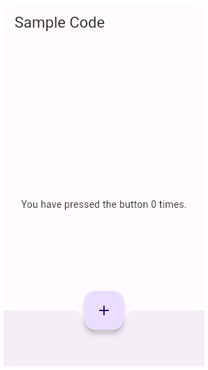 |
| material.SliverGridDelegateWithFixedCrossAxisCount.2 | Here is an example using the [mainAxisExtent] property. On a device with a screen width of 800.0, it creates a GridView with each tile with a width of 200.0 and a height of 150.0. |
| widgets.SliverFillRemaining.3 | In this sample the [SliverFillRemaining] defers to the size of its [child] because the [SliverConstraints.precedingScrollExtent] has gone beyond that of the viewport's main axis. |
| material.Scaffold.2 | This example shows a [Scaffold] with a blueGrey [backgroundColor], [body] and [FloatingActionButton]. The [body] is a [Text] placed in a [Center] in order to center the text within the [Scaffold]. The [FloatingActionButton] is connected to a callback that increments a counter. 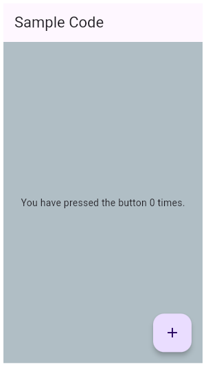 |
| material.FloatingActionButton.2 | This example shows how to make an extended [FloatingActionButton] in a [Scaffold], with a pink [backgroundColor], a thumbs up [Icon] and a [Text] label that reads "Approve". 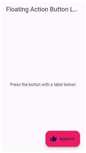 |
| cupertino.AnimatedSize.1 | This example makes a [Container] react to being touched, causing the child of the [AnimatedSize] widget, here a [FlutterLogo], to animate. |
| widgets.RestorableValue.1 | A [StatefulWidget] that has a restorable [int] property. |
| material.showDateRangePicker.1 | This sample demonstrates how to create a restorable Material date range picker. This is accomplished by enabling state restoration by specifying [MaterialApp.restorationScopeId] and using [Navigator.restorablePush] to push [DateRangePickerDialog] when the button is tapped. |
| widgets.Navigator.restorablePushReplacement.1 | Typical usage is as follows: |
| material.AnimatedSize.1 | This example makes a [Container] react to being touched, causing the child of the [AnimatedSize] widget, here a [FlutterLogo], to animate. |
| material.SwitchListTile.3 |  Here is an example of a custom LabeledSwitch widget, but you can easily make your own configurable widget. |
| widgets.InheritedTheme.1 | This example demonstrates how `InheritedTheme.capture()` can be used to wrap the contents of a new route with the inherited themes that are present when the route was built - but are not present when route is actually shown. If the same code is run without `InheritedTheme.capture(), the new route's Text widget will inherit the "something must be wrong" fallback text style, rather than the default text style defined in MyApp. |
| widgets.NestedScrollView.2 | This simple example shows a [NestedScrollView] whose header contains a floating [SliverAppBar]. By using the [floatHeaderSlivers] property, the floating behavior is coordinated between the outer and inner [Scrollable]s, so it behaves as it would in a single scrollable. |
| material.OrderedTraversalPolicy.1 | This sample shows how to assign a traversal order to a widget. In the example, the focus order goes from bottom right (the "One" button) to top left (the "Six" button). |
| material.Ink.4 | One solution would be to deliberately wrap the [Ink.image] in a [Material]. This makes sure the Material that the image is painted on is also responsible for clipping said content. |
| cupertino.SharedAppData.1 | The following sample demonstrates using the automatically created `SharedAppData`. Button presses cause changes to the values for keys 'foo', and 'bar', and those changes only cause the widgets that depend on those keys to be rebuilt. |
| cupertino.CupertinoTextField.1 | This example shows how to set the initial value of the `CupertinoTextField` using a [controller] that already contains some text. |
| cupertino.NestedScrollView.3 | This simple example shows a [NestedScrollView] whose header contains a snapping, floating [SliverAppBar]. _Without_ setting any additional flags, e.g [NestedScrollView.floatHeaderSlivers], the [SliverAppBar] will animate in and out without floating. The [SliverOverlapAbsorber] and [SliverOverlapInjector] maintain the proper alignment between the two separate scroll views. |
| material.InputDecoration.prefixIconConstraints.1 | This example shows the differences between two `TextField` widgets when [prefixIconConstraints] is set to the default value and when one is not. Note that [isDense] must be set to true to be able to set the constraints smaller than 48px. If null, [BoxConstraints] with a minimum width and height of 48px is used. |
| cupertino.AnimatedBuilder.2 | The following example implements a simple counter that utilizes an [AnimatedBuilder] to limit rebuilds to only the [Text] widget. The current count is stored in a [ValueNotifier], which rebuilds the [AnimatedBuilder]'s contents when its value is changed. |
| cupertino.Hero.1 | This sample shows a [Hero] used within a [ListTile]. Tapping on the Hero-wrapped rectangle triggers a hero animation as a new [MaterialPageRoute] is pushed. Both the size and location of the rectangle animates. Both widgets use the same [Hero.tag]. The Hero widget uses the matching tags to identify and execute this animation. |
| cupertino.FocusScope.1 | This example demonstrates using a [FocusScope] to restrict focus to a particular portion of the app. In this case, restricting focus to the visible part of a Stack. |
| material.ErrorWidget.1 | This example shows how to override the standard error widget builder in release mode, but use the standard one in debug mode. The error occurs when you click the "Error Prone" button. |
| material.RotationTransition.1 | The following code implements the [RotationTransition] as seen in the video above: |
| widgets.RawScrollbar.shape.1 | This is an example of using a [StadiumBorder] for drawing the [shape] of the thumb in a [RawScrollbar]. |
| cupertino.CupertinoScrollbar.2 | When [thumbVisibility] is true, the scrollbar thumb will remain visible without the fade animation. This requires that a [ScrollController] is provided to controller, or that the [PrimaryScrollController] is available. [isAlwaysShown] is deprecated in favor of `thumbVisibility`. |
| material.PageView.1 | Here is an example of [PageView]. It creates a centered [Text] in each of the three pages which scroll horizontally. |
| material.PreferredSize.1 | This sample shows a custom widget, similar to an [AppBar], which uses a [PreferredSize] widget, with its height set to 80 logical pixels. Changing the [PreferredSize] can be used to change the height of the custom app bar. |
| widgets.Table.1 | This sample shows a `Table` with borders, multiple types of column widths and different vertical cell alignments. |
| dart.dart_ui.FontFeature.swash.1 | The BioRhyme Expanded font supports the `swsh` feature specifically for the capital "Q" and "R" glyphs and the ampersand. 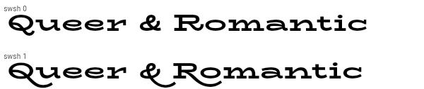 |
| cupertino.Flow.1 | This example uses the [Flow] widget to create a menu that opens and closes as it is interacted with, shown above. The color of the button in the menu changes to indicate which one has been selected. |
| cupertino.AnimatedContainer.1 | The following example (depicted above) transitions an AnimatedContainer between two states. It adjusts the `height`, `width`, `color`, and [alignment] properties when tapped. |
| material.TweenAnimationBuilder.1 | This example shows an [IconButton] that "zooms" in when the widget first builds (its size smoothly increases from 0 to 24) and whenever the button is pressed, it smoothly changes its size to the new target value of either 48 or 24. |
| cupertino.RawScrollbar.3 | When `thumbVisibility` is true, the scrollbar thumb will remain visible without the fade animation. This requires that a [ScrollController] is provided to `controller` for both the [RawScrollbar] and the [GridView]. Alternatively, the [PrimaryScrollController] can be used automatically so long as it is attached to the singular [ScrollPosition] associated with the GridView. |
| cupertino.Shortcuts.2 | This slightly more complicated, but more flexible, example creates a custom [Action] subclass to increment and decrement within a widget (a [Column]) that has keyboard focus. When the user presses the up and down arrow keys, the counter will increment and decrement a data model using the custom actions. One thing that this demonstrates is passing arguments to the [Intent] to be carried to the [Action]. This shows how actions can get data either from their own construction (like the `model` in this example), or from the intent passed to them when invoked (like the increment `amount` in this example). |
| material.ScaffoldMessenger.of.1 | Typical usage of the [ScaffoldMessenger.of] function is to call it in response to a user gesture or an application state change. |
| cupertino.CupertinoSlidingSegmentedControl.1 | This example shows a [CupertinoSlidingSegmentedControl] with an enum type. The callback provided to [onValueChanged] should update the state of the parent [StatefulWidget] using the [State.setState] method, so that the parent gets rebuilt; for example: |
| material.RadioListTile.3 |  Here is an example of a custom LabeledRadio widget, but you can easily make your own configurable widget. |
| material.InputDecoration.labelStyle.1 | It's possible to override the label style for just the error state, or just the default state, or both. In this example the [labelStyle] is specified with a [MaterialStateProperty] which resolves to a text style whose color depends on the decorator's error state. |
| material.SliverFillRemaining.4 | In this sample the [SliverFillRemaining]'s child stretches to fill the overscroll area when [fillOverscroll] is true. This sample also features a button that is pinned to the bottom of the sliver, regardless of size or overscroll behavior. Try switching [fillOverscroll] to see the difference. This sample only shows the overscroll behavior on devices that support overscroll. |
| cupertino.Listener.1 | This example makes a [Container] react to being touched, showing a count of the number of pointer downs and ups. |
| widgets.NavigatorState.restorablePushAndRemoveUntil.1 | Typical usage is as follows: |
| widgets.Navigator.restorablePushAndRemoveUntil.1 | Typical usage is as follows: |
| cupertino.CupertinoSliverNavigationBar.1 | This example shows [CupertinoSliverNavigationBar] in action inside a [CustomScrollView]. |
| material.InkWell.1 | Tap the container to cause it to grow. Then, tap it again and hold before the widget reaches its maximum size to observe the clipped ink splash. |
| widgets.PreferredSize.1 | This sample shows a custom widget, similar to an [AppBar], which uses a [PreferredSize] widget, with its height set to 80 logical pixels. Changing the [PreferredSize] can be used to change the height of the custom app bar. |
| widgets.RawAutocomplete.3 | This example shows the use of RawAutocomplete in a form. |
| material.TextFormField.2 | This example shows how to move the focus to the next field when the user presses the SPACE key. |
| widgets.AnimatedPositioned.1 | The following example transitions an AnimatedPositioned between two states. It adjusts the `height`, `width`, and [Positioned] properties when tapped. |
| widgets.PositionedTransition.1 | The following code implements the [PositionedTransition] as seen in the video above: |
| widgets.InteractiveViewer.1 | This example shows a simple Container that can be panned and zoomed. |
| material.RawAutocomplete.2 | This example is similar to the previous example, but it uses a custom T data type instead of directly using String. |
| material.Card.2 | This sample shows creation of a [Card] widget that can be tapped. When tapped this [Card]'s [InkWell] displays an "ink splash" that fills the entire card. |
| material.SliverFillRemaining.1 | In this sample the [SliverFillRemaining] sizes its [child] to fill the remaining extent of the viewport in both axes. The icon is centered in the sliver, and would be in any computed extent for the sliver. |
| cupertino.CupertinoScrollbar.1 | This sample shows a [CupertinoScrollbar] that fades in and out of view as scrolling occurs. The scrollbar will fade into view as the user scrolls, and fade out when scrolling stops. The `thickness` of the scrollbar will animate from 6 pixels to the `thicknessWhileDragging` of 10 when it is dragged by the user. The `radius` of the scrollbar thumb corners will animate from 34 to the `radiusWhileDragging` of 0 when the scrollbar is being dragged by the user. |
| cupertino.Expanded.2 | This example shows how to use an [Expanded] widget in a [Row] with multiple children expanded, utilizing the [flex] factor to prioritize available space.  |
| dart.dart_ui.FontFeature.numerators.1 | The Piazzolla font supports the `numr` feature. It causes the digits to be rendered smaller and near the top of the EM box. 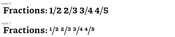 |
| widgets.SliverAnimatedList.1 | This sample application uses a [SliverAnimatedList] to create an animated effect when items are removed or added to the list. |
| cupertino.FocusableActionDetector.1 | This example shows how keyboard interaction can be added to a custom control that changes color when hovered and focused, and can toggle a light when activated, either by touch or by hitting the `X` key on the keyboard when the "And Me" button has the keyboard focus (be sure to use TAB to move the focus to the "And Me" button before trying it out). This example defines its own key binding for the `X` key, but in this case, there is also a default key binding for [ActivateAction] in the default key bindings created by [WidgetsApp] (the parent for [MaterialApp], and [CupertinoApp]), so the `ENTER` key will also activate the buttons. |
| material.ScaleTransition.1 | The following code implements the [ScaleTransition] as seen in the video above: |
| cupertino.ColorFiltered.1 | These two images have two [ColorFilter]s applied with different [BlendMode]s, one with red color and [BlendMode.modulate] another with a grey color and [BlendMode.saturation]. |
| material.ThemeData.extensions.1 | This sample shows how to create and use a subclass of [ThemeExtension] that defines two colors. |
| dart.dart_ui.FontFeature.notationalForms.1 | The Gothic A1 font supports several notational variant sets via the `nalt` feature. Set 1 changes the spacing of the glyphs. Set 2 parenthesizes the latin letters and reduces the numerals to subscripts. Set 3 circles the glyphs. Set 4 parenthesizes the digits. Set 5 uses reverse-video circles for the digits. Set 7 superscripts the digits. The code below shows how to select set 3.  |
| material.ListView.7 | This example shows a custom implementation of [ListTile] selection in a [ListView] or [GridView]. Long press any ListTile to enable selection mode. |
| widgets.Draggable.1 | The following example has a [Draggable] widget along with a [DragTarget] in a row demonstrating an incremented `acceptedData` integer value when you drag the element to the target. |
| cupertino.CupertinoAlertDialog.1 | This sample shows how to use a [CupertinoAlertDialog]. The [CupertinoAlertDialog] shows an alert with a set of two choices when [CupertinoButton] is pressed. |
| widgets.PageView.1 | Here is an example of [PageView]. It creates a centered [Text] in each of the three pages which scroll horizontally. |
| material.BottomNavigationBar.1 | This example shows a [BottomNavigationBar] as it is used within a [Scaffold] widget. The [BottomNavigationBar] has three [BottomNavigationBarItem] widgets, which means it defaults to [BottomNavigationBarType.fixed], and the [currentIndex] is set to index 0. The selected item is amber. The `_onItemTapped` function changes the selected item's index and displays a corresponding message in the center of the [Scaffold]. |
| widgets.DecoratedBoxTransition.1 | The following code implements the [DecoratedBoxTransition] as seen in the video above: |
| material.SlideTransition.1 | The following code implements the [SlideTransition] as seen in the video above: |
| material.Autocomplete.2 | This example shows how to create an Autocomplete widget with a custom type. Try searching with text from the name or email field. |
| material.Divider.1 | This sample shows how to display a Divider between an orange and blue box inside a column. The Divider is 20 logical pixels in height and contains a vertically centered black line that is 5 logical pixels thick. The black line is indented by 20 logical pixels.  |
| material.DropdownButton.selectedItemBuilder.1 | This sample shows a `DropdownButton` with a button with [Text] that corresponds to but is unique from [DropdownMenuItem]. |
| dart.dart_ui.FontFeature.oldstyleFigures.1 | The Piazzolla font supports the `onum` feature. It causes digits to extend below the baseline.  |
| cupertino.Table.1 | This sample shows a `Table` with borders, multiple types of column widths and different vertical cell alignments. |
| widgets.GlowingOverscrollIndicator.2 | This example demonstrates how to use a [NestedScrollView] to manipulate the placement of a [GlowingOverscrollIndicator] when building a [CustomScrollView]. Drag the scrollable to see the bounds of the overscroll indicator. |
| material.Actions.1 | This example creates a custom [Action] subclass `ModifyAction` for modifying a model, and another, `SaveAction` for saving it. This example demonstrates passing arguments to the [Intent] to be carried to the [Action]. Actions can get data either from their own construction (like the `model` in this example), or from the intent passed to them when invoked (like the increment `amount` in this example). This example also demonstrates how to use Intents to limit a widget's dependencies on its surroundings. The `SaveButton` widget defined in this example can invoke actions defined in its ancestor widgets, which can be customized to match the part of the widget tree that it is in. It doesn't need to know about the `SaveAction` class, only the `SaveIntent`, and it only needs to know about a value notifier, not the entire model. |
| material.RestorableValue.1 | A [StatefulWidget] that has a restorable [int] property. |
| widgets.SliverFillRemaining.4 | In this sample the [SliverFillRemaining]'s child stretches to fill the overscroll area when [fillOverscroll] is true. This sample also features a button that is pinned to the bottom of the sliver, regardless of size or overscroll behavior. Try switching [fillOverscroll] to see the difference. This sample only shows the overscroll behavior on devices that support overscroll. |
| material.SliverAppBar.2 | This sample shows a [SliverAppBar] and it's behavior when using the [pinned], [snap] and [floating] parameters. |
| material.NavigationBar.1 | This example shows a [NavigationBar] as it is used within a [Scaffold] widget. The [NavigationBar] has three [NavigationDestination] widgets and the [selectedIndex] is set to index 0. The `onDestinationSelected` callback changes the selected item's index and displays a corresponding widget in the body of the [Scaffold]. |
| dart.dart_ui.FontFeature.slashedZero.1 | The Source Code Pro font supports the `zero` feature. It causes the zero digit to be drawn with a slash rather than the default rendering, which in this case has a dot through the zero rather than a slash.  |
| widgets.FractionallySizedBox.1 | This sample shows a [FractionallySizedBox] whose one child is 50% of the box's size per the width and height factor parameters, and centered within that box by the alignment parameter. |
| widgets.Curve2D.1 | This example shows how to use a [Curve2D] to modify the position of a widget so that it can follow an arbitrary path. |
| material.Shortcuts.2 | This slightly more complicated, but more flexible, example creates a custom [Action] subclass to increment and decrement within a widget (a [Column]) that has keyboard focus. When the user presses the up and down arrow keys, the counter will increment and decrement a data model using the custom actions. One thing that this demonstrates is passing arguments to the [Intent] to be carried to the [Action]. This shows how actions can get data either from their own construction (like the `model` in this example), or from the intent passed to them when invoked (like the increment `amount` in this example). |
| cupertino.SliverGridDelegateWithFixedCrossAxisCount.1 | Here is an example using the [childAspectRatio] property. On a device with a screen width of 800.0, it creates a GridView with each tile with a width of 200.0 and a height of 100.0. |
| material.CheckboxListTile.3 |  Here is an example of a custom LabeledCheckbox widget, but you can easily make your own configurable widget. |
| material.TabBar.1 | This sample shows the implementation of [TabBar] and [TabBarView] using a [DefaultTabController]. Each [Tab] corresponds to a child of the [TabBarView] in the order they are written. |
| dart.dart_ui.FontFeature.characterVariant.1 | The Source Code Pro font supports the `cvXX` feature for several characters. In the example below, variants 1 (`cv01`), 2 (`cv02`), and 4 (`cv04`) are selected. Variant 1 changes the rendering of the "a" character, variant 2 changes the lowercase "g" character, and variant 4 changes the lowercase "i" and "l" characters. There are also variants (not shown here) that control the rendering of various greek characters such as beta and theta. Notably, this can be contrasted with the stylistic sets, where the set which affects the "a" character also affects beta, and the set which affects the "g" character also affects theta and delta.  |
| cupertino.CupertinoSlider.1 | This example shows how to show the current slider value as it changes. |
| widgets.InteractiveViewer.transformationController.1 | This example shows how transformationController can be used to animate the transformation back to its starting position. |
| material.ListTile.selected.1 | Here is an example of using a [StatefulWidget] to keep track of the selected index, and using that to set the `selected` property on the corresponding [ListTile]. |
| cupertino.LinearGradient.1 | This sample draws a picture with a gradient sweeping through different colors, by having a [Container] display a [BoxDecoration] with a [LinearGradient]. |
| material.AppBar.2 | |
| widgets.NestedScrollViewState.1 | [NestedScrollViewState] can be obtained using a [GlobalKey]. Using the following setup, you can access the inner scroll controller using `globalKey.currentState.innerController`. |
| cupertino.WillPopScope.1 | Whenever the back button is pressed, you will get a callback at [onWillPop], which returns a [Future]. If the [Future] returns true, the screen is popped. |
| cupertino.AnimatedWidget.1 | This code defines a widget called `Spinner` that spins a green square continually. It is built with an [AnimatedWidget]. |
| widgets.Flow.1 | This example uses the [Flow] widget to create a menu that opens and closes as it is interacted with, shown above. The color of the button in the menu changes to indicate which one has been selected. |
| widgets.RawScrollbar.2 | This sample shows a [RawScrollbar] that executes a fade animation as scrolling occurs. The RawScrollbar will fade into view as the user scrolls, and fade out when scrolling stops. The [GridView] uses the [PrimaryScrollController] since it has an [Axis.vertical] scroll direction and has not been provided a [ScrollController]. |
| material.NestedScrollView.3 | This simple example shows a [NestedScrollView] whose header contains a snapping, floating [SliverAppBar]. _Without_ setting any additional flags, e.g [NestedScrollView.floatHeaderSlivers], the [SliverAppBar] will animate in and out without floating. The [SliverOverlapAbsorber] and [SliverOverlapInjector] maintain the proper alignment between the two separate scroll views. |
| material.StreamBuilder.1 | This sample shows a [StreamBuilder] that listens to a Stream that emits bids for an auction. Every time the StreamBuilder receives a bid from the Stream, it will display the price of the bid below an icon. If the Stream emits an error, the error is displayed below an error icon. When the Stream finishes emitting bids, the final price is displayed. |
| material.IgnorePointer.1 | The following sample has an [IgnorePointer] widget wrapping the `Column` which contains a button. When [ignoring] is set to `true` anything inside the `Column` can not be tapped. When [ignoring] is set to `false` anything inside the `Column` can be tapped. |
| material.CustomMultiChildLayout.1 | This example shows a [CustomMultiChildLayout] widget being used to lay out colored blocks from start to finish in a cascade that has some overlap. It responds to changes in [Directionality] by re-laying out its children. |
| material.SharedAppData.1 | The following sample demonstrates using the automatically created `SharedAppData`. Button presses cause changes to the values for keys 'foo', and 'bar', and those changes only cause the widgets that depend on those keys to be rebuilt. |
| material.Focus.1 | This example shows how to manage focus using the [Focus] and [FocusScope] widgets. See [FocusNode] for a similar example that doesn't use [Focus] or [FocusScope]. |
| material.SnackBar.1 | Here is an example of a [SnackBar] with an [action] button implemented using [SnackBarAction]. |
| cupertino.CupertinoSegmentedControl.1 | This example shows a [CupertinoSegmentedControl] with an enum type. The callback provided to [onValueChanged] should update the state of the parent [StatefulWidget] using the [State.setState] method, so that the parent gets rebuilt; for example: |
| cupertino.ActionListener.1 | This example shows how ActionListener handles adding and removing of the [listener] in the widget lifecycle. |
| cupertino.RotationTransition.1 | The following code implements the [RotationTransition] as seen in the video above: |
| material.CustomScrollView.2 | By default, if items are inserted at the "top" of a scrolling container like [ListView] or [CustomScrollView], the top item and all of the items below it are scrolled downwards. In some applications, it's preferable to have the top of the list just grow upwards, without changing the scroll position. This example demonstrates how to do that with a [CustomScrollView] with two [SliverList] children, and the [CustomScrollView.center] set to the key of the bottom SliverList. The top one SliverList will grow upwards, and the bottom SliverList will grow downwards. |
| cupertino.CupertinoDatePicker.1 | This sample shows how to implement CupertinoDatePicker with different picker modes. We can provide intiial dateTime value for the picker to display. When user changes the drag the date or time wheels, the picker will call onDateTimeChanged callback. CupertinoDatePicker can be displayed directly on a screen or in a popup. |
| widgets.TextEditingController.1 | This example creates a [TextField] with a [TextEditingController] whose change listener forces the entered text to be lower case and keeps the cursor at the end of the input. |
| cupertino.NestedScrollView.2 | This simple example shows a [NestedScrollView] whose header contains a floating [SliverAppBar]. By using the [floatHeaderSlivers] property, the floating behavior is coordinated between the outer and inner [Scrollable]s, so it behaves as it would in a single scrollable. |
| widgets.RawAutocomplete.focusNode.1 | This examples shows how to create an autocomplete widget with the text field in the AppBar and the results in the main body of the app. |
| material.LinearGradient.1 | This sample draws a picture with a gradient sweeping through different colors, by having a [Container] display a [BoxDecoration] with a [LinearGradient]. |
| cupertino.CupertinoNavigationBar.1 | This example shows a [CupertinoNavigationBar] placed in a [CupertinoPageScaffold]. Since [backgroundColor]'s opacity is not 1.0, there is a blur effect and content slides underneath. |
| widgets.SliverFadeTransition.1 | Creates a [CustomScrollView] with a [SliverFixedExtentList] that uses a [SliverFadeTransition] to fade the list in and out. |
| material.TextButton.1 | This sample shows how to render a disabled TextButton, an enabled TextButton and lastly a TextButton with gradient background. |
| cupertino.SliverFillRemaining.1 | In this sample the [SliverFillRemaining] sizes its [child] to fill the remaining extent of the viewport in both axes. The icon is centered in the sliver, and would be in any computed extent for the sliver. |
| cupertino.FocusTraversalGroup.1 | This sample shows three rows of buttons, each grouped by a [FocusTraversalGroup], each with different traversal order policies. Use tab traversal to see the order they are traversed in. The first row follows a numerical order, the second follows a lexical order (ordered to traverse right to left), and the third ignores the numerical order assigned to it and traverses in widget order. |
| cupertino.InheritedNotifier.1 | This example shows three spinning squares that use the value of the notifier on an ancestor [InheritedNotifier] (`SpinModel`) to give them their rotation. The [InheritedNotifier] doesn't need to know about the children, and the `notifier` argument doesn't need to be an animation controller, it can be anything that implements [Listenable] (like a [ChangeNotifier]). The `SpinModel` class could just as easily listen to another object (say, a separate object that keeps the value of an input or data model value) that is a [Listenable], and get the value from that. The descendants also don't need to have an instance of the [InheritedNotifier] in order to use it, they just need to know that there is one in their ancestry. This can help with decoupling widgets from their models. |
| material.Curve2D.1 | This example shows how to use a [Curve2D] to modify the position of a widget so that it can follow an arbitrary path. |
| cupertino.SingleChildScrollView.1 | In this example, the children are spaced out equally, unless there's no more room, in which case they stack vertically and scroll. When using this technique, [Expanded] and [Flexible] are not useful, because in both cases the "available space" is infinite (since this is in a viewport). The next section describes a technique for providing a maximum height constraint. |
| material.TabBar.2 | [TabBar] can also be implemented by using a [TabController] which provides more options to control the behavior of the [TabBar] and [TabBarView]. This can be used instead of a [DefaultTabController], demonstrated below. |
| widgets.FocusScope.1 | This example demonstrates using a [FocusScope] to restrict focus to a particular portion of the app. In this case, restricting focus to the visible part of a Stack. |
| material.Card.3 | This sample shows creation of [Card] widgets for elevated, filled and outlined types, as described in: https://m3.material.io/components/cards/overview |
| material.InputDecoration.3 | This sample shows how to create a `TextField` with hint text, a red border on all sides, and an error message. To display a red border and error message, provide `errorText` to the `InputDecoration` constructor.  |
| dart.dart_ui.FontFeature.fractions.1 | The Ubuntu Mono font supports the `frac` feature. It causes digits around slashes to be turned into dedicated fraction glyphs. This contrasts to the effect seen with [FontFeature.alternativeFractions].  |
| widgets.Listener.1 | This example makes a [Container] react to being touched, showing a count of the number of pointer downs and ups. |
| material.ReorderableListView.builder.1 | |
| cupertino.PreferredSize.1 | This sample shows a custom widget, similar to an [AppBar], which uses a [PreferredSize] widget, with its height set to 80 logical pixels. Changing the [PreferredSize] can be used to change the height of the custom app bar. |
| cupertino.GlowingOverscrollIndicator.1 | This example demonstrates how to use a [NotificationListener] to manipulate the placement of a [GlowingOverscrollIndicator] when building a [CustomScrollView]. Drag the scrollable to see the bounds of the overscroll indicator. |
| widgets.Expanded.2 | This example shows how to use an [Expanded] widget in a [Row] with multiple children expanded, utilizing the [flex] factor to prioritize available space.  |
| material.RadioListTile.1 |  This widget shows a pair of radio buttons that control the `_character` field. The field is of the type `SingingCharacter`, an enum. |
| animation.Curve2D.1 | This example shows how to use a [Curve2D] to modify the position of a widget so that it can follow an arbitrary path. |
| material.Autocomplete.1 | This example shows how to create a very basic Autocomplete widget using the default UI. |
| widgets.CharacterActivator.1 | In the following example, when a key combination results in a question mark, the counter is increased: |
| cupertino.AutofillGroup.1 | An example form with autofillable fields grouped into different `AutofillGroup`s. |
| material.FocusScope.1 | This example demonstrates using a [FocusScope] to restrict focus to a particular portion of the app. In this case, restricting focus to the visible part of a Stack. |
| material.Slider.1 | 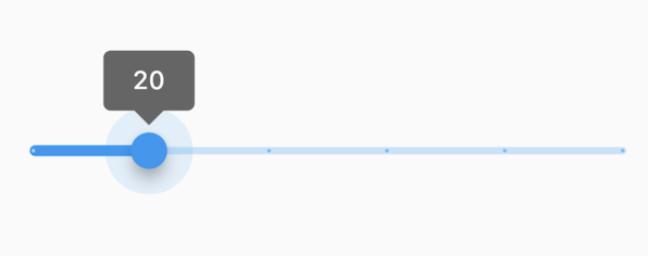 The Sliders value is part of the Stateful widget subclass to change the value setState was called. |
| material.NavigationRail.1 | This example shows a [NavigationRail] used within a Scaffold with 3 [NavigationRailDestination]s. The main content is separated by a divider (although elevation on the navigation rail can be used instead). The `_selectedIndex` is updated by the `onDestinationSelected` callback. |
| widgets.CustomScrollView.2 | By default, if items are inserted at the "top" of a scrolling container like [ListView] or [CustomScrollView], the top item and all of the items below it are scrolled downwards. In some applications, it's preferable to have the top of the list just grow upwards, without changing the scroll position. This example demonstrates how to do that with a [CustomScrollView] with two [SliverList] children, and the [CustomScrollView.center] set to the key of the bottom SliverList. The top one SliverList will grow upwards, and the bottom SliverList will grow downwards. |
| material.ReorderableListView.buildDefaultDragHandles.1 | |
| widgets.AspectRatio.2 | |
| material.DecoratedBoxTransition.1 | The following code implements the [DecoratedBoxTransition] as seen in the video above: |
| material.ColorFiltered.1 | These two images have two [ColorFilter]s applied with different [BlendMode]s, one with red color and [BlendMode.modulate] another with a grey color and [BlendMode.saturation]. |
| material.NestedScrollView.2 | This simple example shows a [NestedScrollView] whose header contains a floating [SliverAppBar]. By using the [floatHeaderSlivers] property, the floating behavior is coordinated between the outer and inner [Scrollable]s, so it behaves as it would in a single scrollable. |
| material.OutlinedButton.1 | Here is an example of a basic [OutlinedButton]. |
| material.ScaffoldState.showBottomSheet.1 | This example demonstrates how to use `showBottomSheet` to display a bottom sheet when a user taps a button. It also demonstrates how to close a bottom sheet using the Navigator. |
| material.ScaffoldMessengerState.showSnackBar.1 | Here is an example of showing a [SnackBar] when the user presses a button. |
| widgets.Shortcuts.2 | This slightly more complicated, but more flexible, example creates a custom [Action] subclass to increment and decrement within a widget (a [Column]) that has keyboard focus. When the user presses the up and down arrow keys, the counter will increment and decrement a data model using the custom actions. One thing that this demonstrates is passing arguments to the [Intent] to be carried to the [Action]. This shows how actions can get data either from their own construction (like the `model` in this example), or from the intent passed to them when invoked (like the increment `amount` in this example). |
| dart.dart_ui.FontFeature.alternative.1 | The Raleway font supports several alternate glyphs. The code below shows how specific glyphs can be selected. With `aalt` set to zero, the default, the normal glyphs are used. With a non-zero value, Raleway substitutes small caps for lower case letters. With value 2, the lowercase "a" changes to a stemless "a", whereas the lowercase "t" changes to a vertical bar instead of having a curve. By targeting specific letters in the text (using [Text.rich]), the desired rendering for each glyph can be achieved.  |
| services.SystemChrome.setSystemUIOverlayStyle.2 | The following example creates a widget that changes the status bar color to a random value on Android. |
| widgets.SlideTransition.1 | The following code implements the [SlideTransition] as seen in the video above: |
| cupertino.Form.1 | This example shows a [Form] with one [TextFormField] to enter an email address and an [ElevatedButton] to submit the form. A [GlobalKey] is used here to identify the [Form] and validate input.  |
| material.SizeTransition.1 | This code defines a widget that uses [SizeTransition] to change the size of [FlutterLogo] continually. It is built with a [Scaffold] where the internal widget has space to change its size. |
| widgets.NavigatorState.restorablePushReplacement.1 | Typical usage is as follows: |
| material.LinearProgressIndicator.1 | This example shows a [LinearProgressIndicator] with a changing value. |
| material.ExpansionTile.1 | This example demonstrates different configurations of ExpansionTile. |
| material.Listener.1 | This example makes a [Container] react to being touched, showing a count of the number of pointer downs and ups. |
| cupertino.Dismissible.1 | This sample shows how you can use the [Dismissible] widget to remove list items using swipe gestures. Swipe any of the list tiles to the left or right to dismiss them from the [ListView]. |
| dart.dart_ui.FontFeature.stylisticAlternates.1 | The Source Code Pro font supports the `salt` feature. It causes some glyphs to be rendered differently, for example the "a" and "g" glyphs change from their typographically common double-storey forms to simpler single-storey forms, the dollar sign's line changes from discontinuous to continuous (and is angled), and the "0" rendering changes from a center dot to a slash.  |
| material.MaterialStateOutlinedBorder.1 | This example defines a subclass of [RoundedRectangleBorder] and an implementation of [MaterialStateOutlinedBorder], that resolves to [RoundedRectangleBorder] when its widget is selected. |
| material.AbsorbPointer.1 | The following sample has an [AbsorbPointer] widget wrapping the button on top of the stack, which absorbs pointer events, preventing its child button __and__ the button below it in the stack from receiving the pointer events. |
| gestures.PointerSignalResolver.1 | Here is an example that demonstrates the effect of not using the resolver versus using it. When this example is set to _not_ use the resolver, then triggering the mouse wheel over the outer box will cause only the outer box to change color, but triggering the mouse wheel over the inner box will cause _both_ the outer and the inner boxes to change color (because they're both receiving the event). When this example is set to _use_ the resolver, then only the box located directly under the cursor will change color when the mouse wheel is triggered. |
| material.AspectRatio.1 | This examples shows how AspectRatio sets width when its parent's width constraint is infinite. Since its parent's allowed height is a fixed value, the actual width is determined via the given AspectRatio. Since the height is fixed at 100.0 in this example and the aspect ratio is set to 16 / 9, the width should then be 100.0 / 9 * 16. |
| rendering.LinearGradient.1 | This sample draws a picture with a gradient sweeping through different colors, by having a [Container] display a [BoxDecoration] with a [LinearGradient]. |
| widgets.Form.1 | This example shows a [Form] with one [TextFormField] to enter an email address and an [ElevatedButton] to submit the form. A [GlobalKey] is used here to identify the [Form] and validate input.  |
| material.InputDecoration.4 | This sample shows how to style a `TextField` with a round border and additional text before and after the input area. It displays "Prefix" before the input area, and "Suffix" after the input area.  |
| services.LogicalKeyboardKey.1 | This example shows how to detect if the user has selected the logical "Q" key. |
| material.Focus.3 | This example shows how to focus a newly-created widget immediately after it is created. The focus node will not actually be given the focus until after the frame in which it has requested focus is drawn, so it is OK to call [FocusNode.requestFocus] on a node which is not yet in the focus tree. |
| material.SliverAnimatedList.1 | This sample application uses a [SliverAnimatedList] to create an animated effect when items are removed or added to the list. |
| material.Scaffold.endDrawer.1 | To disable the drawer edge swipe, set the [Scaffold.endDrawerEnableOpenDragGesture] to false. Then, use [ScaffoldState.openEndDrawer] to open the drawer and [Navigator.pop] to close it. |
| material.Stepper.1 | An example the shows how to use the [Stepper], and the [Stepper] UI appearance. |
| widgets.ListView.7 | This example shows a custom implementation of [ListTile] selection in a [ListView] or [GridView]. Long press any ListTile to enable selection mode. |
| cupertino.AnimatedSwitcher.1 | This sample shows a counter that animates the scale of a text widget whenever the value changes. |
| material.showModalBottomSheet.1 | This example demonstrates how to use `showModalBottomSheet` to display a bottom sheet that obscures the content behind it when a user taps a button. It also demonstrates how to close the bottom sheet using the [Navigator] when a user taps on a button inside the bottom sheet. |
| widgets.Action.overridable.1 | This sample implements a custom text input field that handles the [DeleteCharacterIntent] intent, as well as a US telephone number input widget that consists of multiple text fields for area code, prefix and line number. When the backspace key is pressed, the phone number input widget sends the focus to the preceding text field when the currently focused field becomes empty. |
| widgets.BuildOwner.1 | This example shows how to build an off-screen widget tree used to measure the layout size of the rendered tree. For some use cases, the simpler [Offstage] widget may be a better alternative to this approach. |
| material.showGeneralDialog.1 | This sample demonstrates how to create a restorable dialog. This is accomplished by enabling state restoration by specifying [WidgetsApp.restorationScopeId] and using [Navigator.restorablePush] to push [RawDialogRoute] when the button is tapped. {@macro flutter.widgets.RestorationManager} |
| cupertino.FadeTransition.1 | The following code implements the [FadeTransition] using the Flutter logo: |
| dart.dart_ui.FontFeature.1 | This example shows usage of several OpenType font features, including Small Caps (selected manually using the "smcp" code), old-style figures, fractional ligatures, and stylistic sets. |
| widgets.Shortcuts.1 | Here, we will use the [Shortcuts] and [Actions] widgets to add and subtract from a counter. When the child widget has keyboard focus, and a user presses the keys that have been defined in [Shortcuts], the action that is bound to the appropriate [Intent] for the key is invoked. It also shows the use of a [CallbackAction] to avoid creating a new [Action] subclass. |
| cupertino.GridView.4 | This example shows a custom implementation of [ListTile] selection in a [GridView] or [ListView]. Long press any ListTile to enable selection mode. |
| material.FocusTraversalGroup.1 | This sample shows three rows of buttons, each grouped by a [FocusTraversalGroup], each with different traversal order policies. Use tab traversal to see the order they are traversed in. The first row follows a numerical order, the second follows a lexical order (ordered to traverse right to left), and the third ignores the numerical order assigned to it and traverses in widget order. |
| material.SliverFillRemaining.2 | In this sample the [SliverFillRemaining] defers to the size of its [child] because the child's extent exceeds that of the remaining extent of the viewport's main axis. |
| scrollbar.RawScrollbar.shape.1 | This is an example of using a [StadiumBorder] for drawing the [shape] of the thumb in a [RawScrollbar]. |
| cupertino.LayoutBuilder.1 | This example uses a [LayoutBuilder] to build a different widget depending on the available width. Resize the DartPad window to see [LayoutBuilder] in action! |
| widgets.Focus.3 | This example shows how to focus a newly-created widget immediately after it is created. The focus node will not actually be given the focus until after the frame in which it has requested focus is drawn, so it is OK to call [FocusNode.requestFocus] on a node which is not yet in the focus tree. |
| widgets.OverflowBar.1 | This example defines a simple approximation of a dialog layout, where the layout of the dialog's action buttons are defined by an [OverflowBar]. The content is wrapped in a [SingleChildScrollView], so that if overflow occurs, the action buttons will still be accessible by scrolling, no matter how much vertical space is available. |
| cupertino.InteractiveViewer.1 | This example shows a simple Container that can be panned and zoomed. |
| cupertino.Shortcuts.1 | Here, we will use the [Shortcuts] and [Actions] widgets to add and subtract from a counter. When the child widget has keyboard focus, and a user presses the keys that have been defined in [Shortcuts], the action that is bound to the appropriate [Intent] for the key is invoked. It also shows the use of a [CallbackAction] to avoid creating a new [Action] subclass. |
| dart.dart_ui.FontFeature.alternativeFractions.1 | The Ubuntu Mono font supports the `afrc` feature. It causes digits before slashes to become superscripted and digits after slashes to become subscripted. This contrasts to the effect seen with [FontFeature.fractions].  |
| dart.dart_ui.FontFeature.denominator.1 | The Piazzolla font supports the `dnom` feature. It causes the digits to be rendered smaller and near the bottom of the EM box.  |
| widgets.RestorationMixin.1 | This example demonstrates how to make a simple counter app restorable by using the [RestorationMixin] and a [RestorableInt]. |
| widgets.AspectRatio.3 | |
| material.ExpansionPanelList.radio.1 | Here is a simple example of how to implement ExpansionPanelList.radio. |
| widgets.AnimatedSwitcher.1 | This sample shows a counter that animates the scale of a text widget whenever the value changes. |
| material.Dismissible.1 | This sample shows how you can use the [Dismissible] widget to remove list items using swipe gestures. Swipe any of the list tiles to the left or right to dismiss them from the [ListView]. |
| material.Draggable.1 | The following example has a [Draggable] widget along with a [DragTarget] in a row demonstrating an incremented `acceptedData` integer value when you drag the element to the target. |
| material.NavigationRail.extendedAnimation.1 | This example shows how to use this animation to create a [FloatingActionButton] that animates itself between the normal and extended states of the [NavigationRail]. An instance of `MyNavigationRailFab` is created for [NavigationRail.leading]. Pressing the FAB button toggles the "extended" state of the [NavigationRail]. |
| cupertino.AbsorbPointer.1 | The following sample has an [AbsorbPointer] widget wrapping the button on top of the stack, which absorbs pointer events, preventing its child button __and__ the button below it in the stack from receiving the pointer events. |
| material.InputDecoration.6 | This sample shows how to style a `TextField` with a prefixIcon that changes color based on the `MaterialState` through the use of `ThemeData`. The color defaults to gray, be blue while focused and red if in an error state. |
| cupertino.ErrorWidget.1 | This example shows how to override the standard error widget builder in release mode, but use the standard one in debug mode. The error occurs when you click the "Error Prone" button. |
| cupertino.Notification.1 | This example shows a [NotificationListener] widget that listens for [ScrollNotification] notifications. When a scroll event occurs in the [NestedScrollView], this widget is notified. The events could be either a [ScrollStartNotification]or[ScrollEndNotification]. |
| cupertino.SliverFillRemaining.3 | In this sample the [SliverFillRemaining] defers to the size of its [child] because the [SliverConstraints.precedingScrollExtent] has gone beyond that of the viewport's main axis. |
| cupertino.AnimatedSlide.1 | This code defines a widget that uses [AnimatedSlide] to translate a [FlutterLogo] up or down by the amount of it's height with each press of the corresponding button. |
| widgets.NavigatorState.restorablePush.1 | Typical usage is as follows: |
| material.StandardFabLocation.1 | This is an example of a user-defined [FloatingActionButtonLocation]. The example shows a [Scaffold] with an [AppBar], a [BottomAppBar], and a [FloatingActionButton] using a custom [FloatingActionButtonLocation]. The new [FloatingActionButtonLocation] is defined by extending [StandardFabLocation] with two mixins, [FabEndOffsetX] and [FabFloatOffsetY], and overriding the [getOffsetX] method to adjust the FAB's x-coordinate, creating a [FloatingActionButtonLocation] slightly different from [FloatingActionButtonLocation.endFloat]. |
| cupertino.RawAutocomplete.1 | This example shows how to create a very basic autocomplete widget using the [fieldViewBuilder] and [optionsViewBuilder] parameters. |
| material.CircularProgressIndicator.1 | This example shows a [CircularProgressIndicator] with a changing value. |
| cupertino.PageStorage.1 | This sample shows how to explicitly use a [PageStorage] to store the states of its children pages. Each page includes a scrollable list, whose position is preserved when switching between the tabs thanks to the help of [PageStorageKey]. |
| dart.dart_ui.FontFeature.stylisticSet.2 | The Piazzolla font supports the `ssXX` feature for more elaborate stylistic effects. Set 1 turns some Latin characters into Roman numerals, set 2 enables some ASCII characters to be used to create pretty arrows, and so forth. _These_ stylistic sets do _not_ correspond to character variants.  |
| widgets.WillPopScope.1 | Whenever the back button is pressed, you will get a callback at [onWillPop], which returns a [Future]. If the [Future] returns true, the screen is popped. |
| widgets.InteractiveViewer.builder.1 | This example shows how to use builder to create a [Table] whose cell contents are only built when they are visible. Built and remove cells are logged in the console for illustration. |
| material.AnimatedSwitcher.1 | This sample shows a counter that animates the scale of a text widget whenever the value changes. |
| widgets.FocusNode.1 | This example shows how a FocusNode should be managed if not using the [Focus] or [FocusScope] widgets. See the [Focus] widget for a similar example using [Focus] and [FocusScope] widgets. |
| widgets.GestureDetector.2 | This example uses a [Container] that wraps a [GestureDetector] widget which detects a tap. Since the [GestureDetector] does not have a child, it takes on the size of its parent, making the entire area of the surrounding [Container] clickable. When tapped, the [Container] turns yellow by setting the `_color` field. When tapped again, it goes back to white. |
| material.InheritedTheme.1 | This example demonstrates how `InheritedTheme.capture()` can be used to wrap the contents of a new route with the inherited themes that are present when the route was built - but are not present when route is actually shown. If the same code is run without `InheritedTheme.capture(), the new route's Text widget will inherit the "something must be wrong" fallback text style, rather than the default text style defined in MyApp. |
| widgets.SingleChildScrollView.1 | In this example, the children are spaced out equally, unless there's no more room, in which case they stack vertically and scroll. When using this technique, [Expanded] and [Flexible] are not useful, because in both cases the "available space" is infinite (since this is in a viewport). The next section describes a technique for providing a maximum height constraint. |
| material.Radio.toggleable.1 | This example shows how to enable deselecting a radio button by setting the [toggleable] attribute. |
| widgets.Hero.1 | This sample shows a [Hero] used within a [ListTile]. Tapping on the Hero-wrapped rectangle triggers a hero animation as a new [MaterialPageRoute] is pushed. Both the size and location of the rectangle animates. Both widgets use the same [Hero.tag]. The Hero widget uses the matching tags to identify and execute this animation. |
| material.GlowingOverscrollIndicator.1 | This example demonstrates how to use a [NotificationListener] to manipulate the placement of a [GlowingOverscrollIndicator] when building a [CustomScrollView]. Drag the scrollable to see the bounds of the overscroll indicator. |
| dart.dart_ui.FontFeature.stylisticSet.1 | The Source Code Pro font supports the `ssXX` feature for several sets. In the example below, stylistic sets 2 (`ss02`), 3 (`ss03`), and 4 (`ss04`) are selected. Stylistic set 2 changes the rendering of the "a" character and the beta character, stylistic set 3 changes the lowercase "g", theta, and delta characters, and stylistic set 4 changes the lowercase "i" and "l" characters. This font also supports character variants (see [FontFeature.characterVariant]).  |
| widgets.InheritedNotifier.1 | This example shows three spinning squares that use the value of the notifier on an ancestor [InheritedNotifier] (`SpinModel`) to give them their rotation. The [InheritedNotifier] doesn't need to know about the children, and the `notifier` argument doesn't need to be an animation controller, it can be anything that implements [Listenable] (like a [ChangeNotifier]). The `SpinModel` class could just as easily listen to another object (say, a separate object that keeps the value of an input or data model value) that is a [Listenable], and get the value from that. The descendants also don't need to have an instance of the [InheritedNotifier] in order to use it, they just need to know that there is one in their ancestry. This can help with decoupling widgets from their models. |
| widgets.AnimatedBuilder.1 | This code defines a widget that spins a green square continually. It is built with an [AnimatedBuilder] and makes use of the [child] feature to avoid having to rebuild the [Container] each time. |
| cupertino.NestedScrollViewState.1 | [NestedScrollViewState] can be obtained using a [GlobalKey]. Using the following setup, you can access the inner scroll controller using `globalKey.currentState.innerController`. |
| material.SwitchListTile.2 |  Here is an example of a custom labeled radio widget, called LinkedLabelRadio, that includes an interactive [RichText] widget that handles tap gestures. |
| material.GestureDetector.1 | This example contains a black light bulb wrapped in a [GestureDetector]. It turns the light bulb yellow when the "TURN LIGHT ON" button is tapped by setting the `_lights` field, and off again when "TURN LIGHT OFF" is tapped. |
| widgets.Offstage.1 | This example shows a [FlutterLogo] widget when the `_offstage` member field is false, and hides it without any room in the parent when it is true. When offstage, this app displays a button to get the logo size, which will be displayed in a [SnackBar]. |
| material.Scrollbar.2 | When [thumbVisibility] is true, the scrollbar thumb will remain visible without the fade animation. This requires that a [ScrollController] is provided to controller, or that the [PrimaryScrollController] is available. When a [ScrollView.scrollDirection] is [Axis.horizontal], it is recommended that the [Scrollbar] is always visible, since scrolling in the horizontal axis is less discoverable. |
| dart.dart_ui.FontFeature.localeAware.1 | The Noto Sans CJK font supports the `locl` feature for CJK characters. In this example, the `localeAware` feature is not explicitly used, as it is enabled by default. This example instead shows how to set the locale, thus demonstrating how Noto Sans adapts the glyph shapes to the locale.  |
| widgets.FocusableActionDetector.1 | This example shows how keyboard interaction can be added to a custom control that changes color when hovered and focused, and can toggle a light when activated, either by touch or by hitting the `X` key on the keyboard when the "And Me" button has the keyboard focus (be sure to use TAB to move the focus to the "And Me" button before trying it out). This example defines its own key binding for the `X` key, but in this case, there is also a default key binding for [ActivateAction] in the default key bindings created by [WidgetsApp] (the parent for [MaterialApp], and [CupertinoApp]), so the `ENTER` key will also activate the buttons. |
| material.SliverFadeTransition.1 | Creates a [CustomScrollView] with a [SliverFixedExtentList] that uses a [SliverFadeTransition] to fade the list in and out. |
| widgets.InteractiveViewer.constrained.1 | This example shows how to create a pannable table. Because the table is larger than the entire screen, setting `constrained` to false is necessary to allow it to be drawn to its full size. The parts of the table that exceed the screen size can then be panned into view. |
| material.InputDecoration.floatingLabelStyle.1 | It's possible to override the label style for just the error state, or just the default state, or both. In this example the [floatingLabelStyle] is specified with a [MaterialStateProperty] which resolves to a text style whose color depends on the decorator's error state. |
| widgets.RawAutocomplete.2 | This example is similar to the previous example, but it uses a custom T data type instead of directly using String. |
| cupertino.AspectRatio.1 | This examples shows how AspectRatio sets width when its parent's width constraint is infinite. Since its parent's allowed height is a fixed value, the actual width is determined via the given AspectRatio. Since the height is fixed at 100.0 in this example and the aspect ratio is set to 16 / 9, the width should then be 100.0 / 9 * 16. |
| widgets.AnimatedContainer.1 | The following example (depicted above) transitions an AnimatedContainer between two states. It adjusts the `height`, `width`, `color`, and [alignment] properties when tapped. |
| widgets.StreamBuilder.1 | This sample shows a [StreamBuilder] that listens to a Stream that emits bids for an auction. Every time the StreamBuilder receives a bid from the Stream, it will display the price of the bid below an icon. If the Stream emits an error, the error is displayed below an error icon. When the Stream finishes emitting bids, the final price is displayed. |
| widgets.SingleChildScrollView.2 | In this example, the column becomes either as big as viewport, or as big as the contents, whichever is biggest. |
| material.TabController.2 | This example shows how to listen to page updates in [TabBar] and [TabBarView] when using [DefaultTabController]. |
| material.DataTable.2 | This sample shows how to display a [DataTable] with alternate colors per row, and a custom color for when the row is selected. |
| cupertino.SharedAppData.2 | The following sample demonstrates how a single lazily computed value could be shared within an app. A Flutter package that provided custom widgets might use this approach to share a (possibly private) value with instances of those widgets. |
| cupertino.OverflowBar.1 | This example defines a simple approximation of a dialog layout, where the layout of the dialog's action buttons are defined by an [OverflowBar]. The content is wrapped in a [SingleChildScrollView], so that if overflow occurs, the action buttons will still be accessible by scrolling, no matter how much vertical space is available. |
| cupertino.AnimatedBuilder.1 | This code defines a widget that spins a green square continually. It is built with an [AnimatedBuilder] and makes use of the [child] feature to avoid having to rebuild the [Container] each time. |
| widgets.RotationTransition.1 | The following code implements the [RotationTransition] as seen in the video above: |
| material.CheckboxListTile.1 |  This widget shows a checkbox that, when checked, slows down all animations (including the animation of the checkbox itself getting checked!). This sample requires that you also import 'package:flutter/scheduler.dart', so that you can reference [timeDilation]. |
| material.PageStorage.1 | This sample shows how to explicitly use a [PageStorage] to store the states of its children pages. Each page includes a scrollable list, whose position is preserved when switching between the tabs thanks to the help of [PageStorageKey]. |
| cupertino.AnimatedList.1 | This sample application uses an [AnimatedList] to create an effect when items are removed or added to the list. |
| widgets.SliverGridDelegateWithFixedCrossAxisCount.2 | Here is an example using the [mainAxisExtent] property. On a device with a screen width of 800.0, it creates a GridView with each tile with a width of 200.0 and a height of 150.0. |
| material.WillPopScope.1 | Whenever the back button is pressed, you will get a callback at [onWillPop], which returns a [Future]. If the [Future] returns true, the screen is popped. |
| cupertino.PlatformMenuBar.1 | This example shows a [PlatformMenuBar] that contains a single top level menu, containing three items for "About", a toggleable menu item for showing a message, a cascading submenu with message choices, and "Quit". **This example will only work on macOS.** |
| material.RadioListTile.toggleable.1 | This example shows how to enable deselecting a radio button by setting the [toggleable] attribute. |
| cupertino.IgnorePointer.1 | The following sample has an [IgnorePointer] widget wrapping the `Column` which contains a button. When [ignoring] is set to `true` anything inside the `Column` can not be tapped. When [ignoring] is set to `false` anything inside the `Column` can be tapped. |
| widgets.FutureBuilder.1 | This sample shows a [FutureBuilder] that displays a loading spinner while it loads data. It displays a success icon and text if the [Future] completes with a result, or an error icon and text if the [Future] completes with an error. Assume the `_calculation` field is set by pressing a button elsewhere in the UI. |
| material.GridView.4 | This example shows a custom implementation of [ListTile] selection in a [GridView] or [ListView]. Long press any ListTile to enable selection mode. |
| cupertino.SliverFillRemaining.4 | In this sample the [SliverFillRemaining]'s child stretches to fill the overscroll area when [fillOverscroll] is true. This sample also features a button that is pinned to the bottom of the sliver, regardless of size or overscroll behavior. Try switching [fillOverscroll] to see the difference. This sample only shows the overscroll behavior on devices that support overscroll. |
| cupertino.CupertinoActionSheet.1 | This sample shows how to use a [CupertinoActionSheet]. The [CupertinoActionSheet] shows a modal popup that slides in from the bottom when [CupertinoButton] is pressed. |
| material.TextEditingController.1 | This example creates a [TextField] with a [TextEditingController] whose change listener forces the entered text to be lower case and keeps the cursor at the end of the input. |
| dart.dart_ui.FontFeature.tabularFigures.1 | The Piazzolla font supports the `tnum` feature. It causes the digits to become uniformly-sized, rather than having variable widths. In this font this is especially noticeable with the digit "1"; with tabular figures enabled, the "1" digit is more widely spaced.  |
| cupertino.SingleChildScrollView.2 | In this example, the column becomes either as big as viewport, or as big as the contents, whichever is biggest. |
| cupertino.CharacterActivator.1 | In the following example, when a key combination results in a question mark, the counter is increased: |
| widgets.SliverAnimatedOpacity.1 | Creates a [CustomScrollView] with a [SliverFixedExtentList] and a [FloatingActionButton]. Pressing the button animates the lists' opacity. |
| cupertino.Curve2D.1 | This example shows how to use a [Curve2D] to modify the position of a widget so that it can follow an arbitrary path. |
| widgets.FadeTransition.1 | The following code implements the [FadeTransition] using the Flutter logo: |
| material.GestureDetector.2 | This example uses a [Container] that wraps a [GestureDetector] widget which detects a tap. Since the [GestureDetector] does not have a child, it takes on the size of its parent, making the entire area of the surrounding [Container] clickable. When tapped, the [Container] turns yellow by setting the `_color` field. When tapped again, it goes back to white. |
| material.Radio.1 | Here is an example of Radio widgets wrapped in ListTiles, which is similar to what you could get with the RadioListTile widget. The currently selected character is passed into `groupValue`, which is maintained by the example's `State`. In this case, the first `Radio` will start off selected because `_character` is initialized to `SingingCharacter.lafayette`. If the second radio button is pressed, the example's state is updated with `setState`, updating `_character` to `SingingCharacter.jefferson`. This causes the buttons to rebuild with the updated `groupValue`, and therefore the selection of the second button. Requires one of its ancestors to be a [Material] widget. |
| widgets.ColorFiltered.1 | These two images have two [ColorFilter]s applied with different [BlendMode]s, one with red color and [BlendMode.modulate] another with a grey color and [BlendMode.saturation]. |
| widgets.AnimatedSize.1 | This example makes a [Container] react to being touched, causing the child of the [AnimatedSize] widget, here a [FlutterLogo], to animate. |
| cupertino.MouseRegion.1 | This example makes a [Container] react to being entered by a mouse pointer, showing a count of the number of entries and exits. |
| material.RestorationMixin.1 | This example demonstrates how to make a simple counter app restorable by using the [RestorationMixin] and a [RestorableInt]. |
| widgets.AnimatedAlign.1 | The following code implements the [AnimatedAlign] widget, using a [curve] of [Curves.fastOutSlowIn]. |
| cupertino.AnimatedPadding.1 | The following code implements the [AnimatedPadding] widget, using a [curve] of [Curves.easeInOut]. |
| cupertino.RestorationMixin.1 | This example demonstrates how to make a simple counter app restorable by using the [RestorationMixin] and a [RestorableInt]. |
| dart.dart_ui.FontFeature.subscripts.1 | The Piazzolla font supports the `subs` feature. It causes digits to be smaller and subscripted.  |
| material.Expanded.2 | This example shows how to use an [Expanded] widget in a [Row] with multiple children expanded, utilizing the [flex] factor to prioritize available space.  |
| cupertino.CustomScrollView.2 | By default, if items are inserted at the "top" of a scrolling container like [ListView] or [CustomScrollView], the top item and all of the items below it are scrolled downwards. In some applications, it's preferable to have the top of the list just grow upwards, without changing the scroll position. This example demonstrates how to do that with a [CustomScrollView] with two [SliverList] children, and the [CustomScrollView.center] set to the key of the bottom SliverList. The top one SliverList will grow upwards, and the bottom SliverList will grow downwards. |
| material.SingleChildScrollView.2 | In this example, the column becomes either as big as viewport, or as big as the contents, whichever is biggest. |
| material.MouseCursor.1 | This sample creates a rectangular region that is wrapped by a [MouseRegion] with a system mouse cursor. The mouse pointer becomes an I-beam when hovering over the region. |
| cupertino.DefaultTextStyleTransition.1 | The following code implements the [DefaultTextStyleTransition] that shows a transition between thick blue font and thin red font. |
| cupertino.PositionedTransition.1 | The following code implements the [PositionedTransition] as seen in the video above: |
| services.PhysicalKeyboardKey.1 | This example shows how to detect if the user has selected the physical key to the right of the CAPS LOCK key. |
| material.FractionallySizedBox.1 | This sample shows a [FractionallySizedBox] whose one child is 50% of the box's size per the width and height factor parameters, and centered within that box by the alignment parameter. |
| material.MaterialStateBorderSide.1 | This example defines a subclass of [MaterialStateBorderSide], that resolves to a red border side when its widget is selected. |
Conclusion
In this article, We looked at the Flutter samples available from the flutter create command using the --sample=id parameter. We looked at a few different approaches to selecting a sample. We can go through all of the available samples by using the searchable table in this article. We can also go to the Flutter official docs to understand a lot more about the widgets. Finally, we can explore the Flutter GitHub examples page and examine the code of the samples.
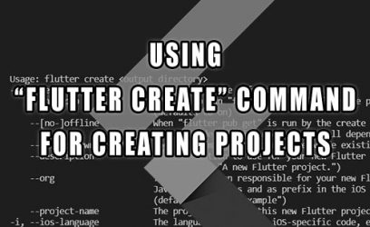